

Ladies and Gentlemen of the world we call rugs, welcome to part (1) of a two (2) part series in which carpets, trends, and gossipy opinion from both the NYICS and “The Rug Show” will be the topic of discussion. While this installment will focus solely on carpets and rugs and trends, gossip and opinion will be condensed into a cesspool of tumultuous near acerbic rage in the second installment to follow posthaste. This division was necessitated by a desire to keep the treatment of the carpets fair and balanced as is said (with whatever meaning that has in this day and age), while allowing the perhaps more entertaining banter of the discussion’s balance to live a life of its own. Hopefully neither will disappoint you my faithful readers. So with only a brief further introduction, here is what you’ve come for:
As many of you may know or at least infer, my relationship with Tamarian can best be described as love/hate. Sure I don’t agree with them (in a broad over-reaching corporation as a person way) on many fronts, but at the same time they do some pretty innovative and spectacular things, and it is just one of these things that has garnered them the coveted spot as the lead review.
Tamarian (With the second “a” long)
Visitors to this year’s NYICS were greeted by an expansive Tamarian booth that dominated the frontage along the elevator bank, and with the eponymous entry mat situated along the leading edge, there was no mistake whose rugs it was you were about to see. Now I am not typically a fan of entry mats of this ilk as I find them somewhat juvenile and naive from a design perspective and it seems no matter how well thought out, the execution most often falls short; but not this time. Tamarian produced an entry mat that not only looked great (in terms of craftsmanship – a likely testament to a very skilled weaver) but also balanced the gimmicky nature inherent to this type of rug with a genuine and authentic purpose: Introducing their new real time inventory system accessed via QR codes. A purpose, that upon reflection, I fell is/was a well thought out marketing plan.
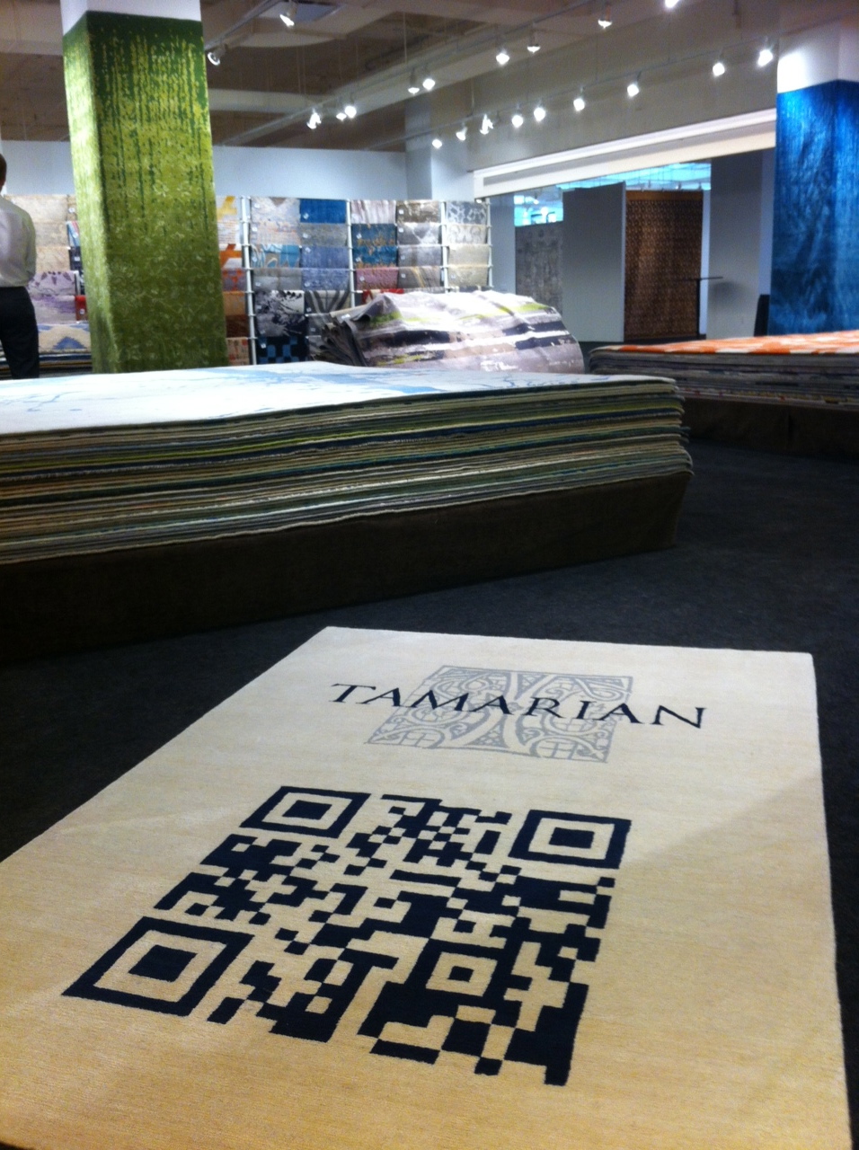
Tamarian’s Entry Mat at NYICS 2012
Dealer: “Oh look at the entry mat over there with your name and that code thingy (This is how I imagine non technologically savvy rug dealers talking.) on it. Does it actually scan?”
Tamarian Representative: “Of course it does, but do you know what else scans…..”
And voila! You (as a customer) just walked into their marketing trap! But wait! There is more! It’s not just a trap. It is a very powerful tool for customers (at any level) to check stock. All you do is scan the QR code on a full sized rug, or on one of there samples and your little electronic devise will take you to their website giving you current stock and availability (including delivery times) as well as a full sized image of the design. Essentially, all of the information you (as a salesperson) need to close the sale. I asked Ned Baker of Tamarian about the potential for a customer being disappointed, particularly in a situation where I (by example) as the customer checked stock, only to find out the piece was subsequently sold. Ned conceded that it would be possible for say a rug showing as “IN STOCK – OUT ON CONSIGNMENT” (my phrasing of the situation) to actually be sold as the dealer had failed to report it as sold. Now of course none of us know of this happening in the rug industry, so that could never happen. **The Ruggist makes a very rude face** It seems the fault, if any, in their system lies with the pesky humans!
In discussing this with a ruggist insider (not from the rug industry), he told me that the goal of this system is likely to increase overal customer satisfaction by putting more power in the hands of the customer, and not to replace customer service. It is just another tool to help salespeople close the sale; one that augments not replaces personalized customer service, something the folks at Tamarian envision as well.
Footnote: I have branded this new QR inventory system as “CiborStock”. Which I will allow the fine folks at Tamarian to use royalty free. Of course, once they imagine someone from Boston or Brooklyn saying CiborStock the name just may not work.
Sahar
If you are to believe the propaganda, err advertising, of some of the larger (if not unassuming) egos in the rug industry you would no doubt be led to believe that in any given group of five (5) rug designers no fewer than six (6) of them invented everything from rug weaving, to overspun yarn, to overdying, to knotting, to importing, to every design idea ever since before dirt was new. Without deference to those who have come before me, I “respectfully” submit that there is nothing new under the sun particularly when it comes to carpets that explore the interplay of colour, for whom amongst us can rightly claim to have invented colour?
But this is not to say there aren’t those who excel at what others lay claim. Those who have mastered the art of interpreting the natural wonder that is our ability to perceive colour and who continue to inspire with their beautifully crafted carpets. Those who remain humble, despite perhaps what could be some well earned hubris. With that I give you this carpet from Sahar.

Untitled Carpet from Sahar
Kooches
Perennial favourite of “The Ruggist”, Kooches did not fail to impress once again this year by offering up Tom DeMarco’s signature aesthetic and nearly unequaled attention to quality and detail in construction. [[Copious and gratuitous praise inserted here]] I’ve always kind of viewed the rugs of Kooches as the kind of rug that a rug snob would purchase: Elegant and apparently simple designs executed with great precision and sold by a very unassuming gentleman.
Of particular interest this year was “Indian Flower”. Excellent aubrush (however you’d like to spell that), with a lovely design rendered in black on cream using a technically challenging to weave, stippled effect. If the design were fully outlined and mutli-coloured I would be tempted to say it is reminiscent of art nouveau perhaps arts and crafts style carpets of the turn of the former century. In its current form however the design brings a highly sophisticated treatment to black and white colourations favoured by the design community.
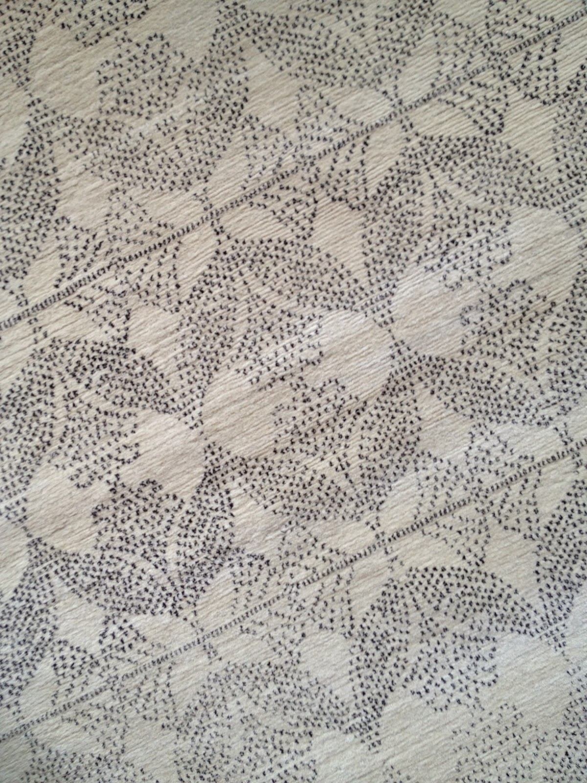
Perspective Detail of “Indian Flower” by Kooches
Gary Cruz
As alluded to, ok blatantly stated, in my last post I marvel at those who would join the rug industry particularly in this day and age, and moreover because of this feel a slight degree of personal responsibility to welcome them, as if I was some emissary of the world of rugs. But I’m not. I’m just a guy who loves rugs, thinks everyone should be cordial while remaining competitive, and who thinks originality is a concept to be rewarded not by imitation, but by praise. But that is a topic for another time and place. Or is it?
The rugs of Gary Cruz are a fresh and bold statement against the current trends in the rug industry, harkening back to a time when the Tibetan/Nepali industry was young (as viewed by westerners). Designs were less complicated, colours were more primary, and carpets had this sort of naive beauty of youth not yet tainted by the argument of living, to quote Franz Ferdinand. The delusions of nostalgia aside, Mr. Cruz has crafted some truly original and refreshing carpets worthy of praise.
Take, by example, “Acapulco” as shown below. Obviously this design incorporates elements and traditions from Mexican and dare I say Aztec oeuvres, and if he were but creating a reproduction I would find nothing of note. In his treatment of these elements (a classic rug industry design staple – borrowing designs not native to hand knotted pile carpets) however my interest is sparked. The repeating Aztecian cartouche depicted in three hues of blue set against a cream field remind me of classic Delft, while the choice of blues – hardly discernable in difference especially in the intense equatorial sun inherent to the region(s) from whence the design is inspired, adds a layer of subtle sophistication to a rug many view as simply two (2) colour. Or, it’s just pretty. Either way, I enjoy it.
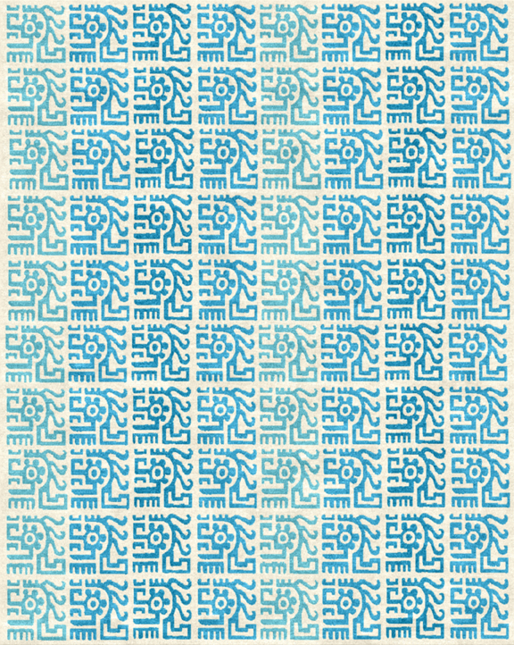
Acapulco by Gary Cruz Studio
Wool and Silk
I’m fussy and I unequivocally dislike the overuse of beige and neutrals. Not because there is anything inherently wrong with the colours, but rather because of a certain unimaginative underbelly of the design industry prescribing beige/neutrals as the panacea to end all that ails you decoratively. So it is going to come as quite a shock as I reveal that one of my favourite standouts of the 2012 NYICS is in fact a neutral carpet from none other than Erbil Tezcan at Wool and Silk. Why? To borrow phrasing from a dear friend named Bennet Bean, because this carpet is simply put: Perfect.
Mr. Tezcan (and without doubt the skilled weavers producing his carpets) have produced what I consider to be the best example to date of a gradated single hue carpet. Made in Wool and Silk’s signature blended yarn which conveys both a lustrous finish and a supple hand, the twenty-four (24) values utilized across the gradient allow this carpet to succeed in achieving the smooth transition and natural look that many have tried but only failed to reach. Moreover the simple single hue border defines the carpet as such, and provides a lovely contrast across the length of the gradient.
Of course, as this is in its essence a single colour rug, we could order it in something less beige if we so desired. Ausgezeichnet!
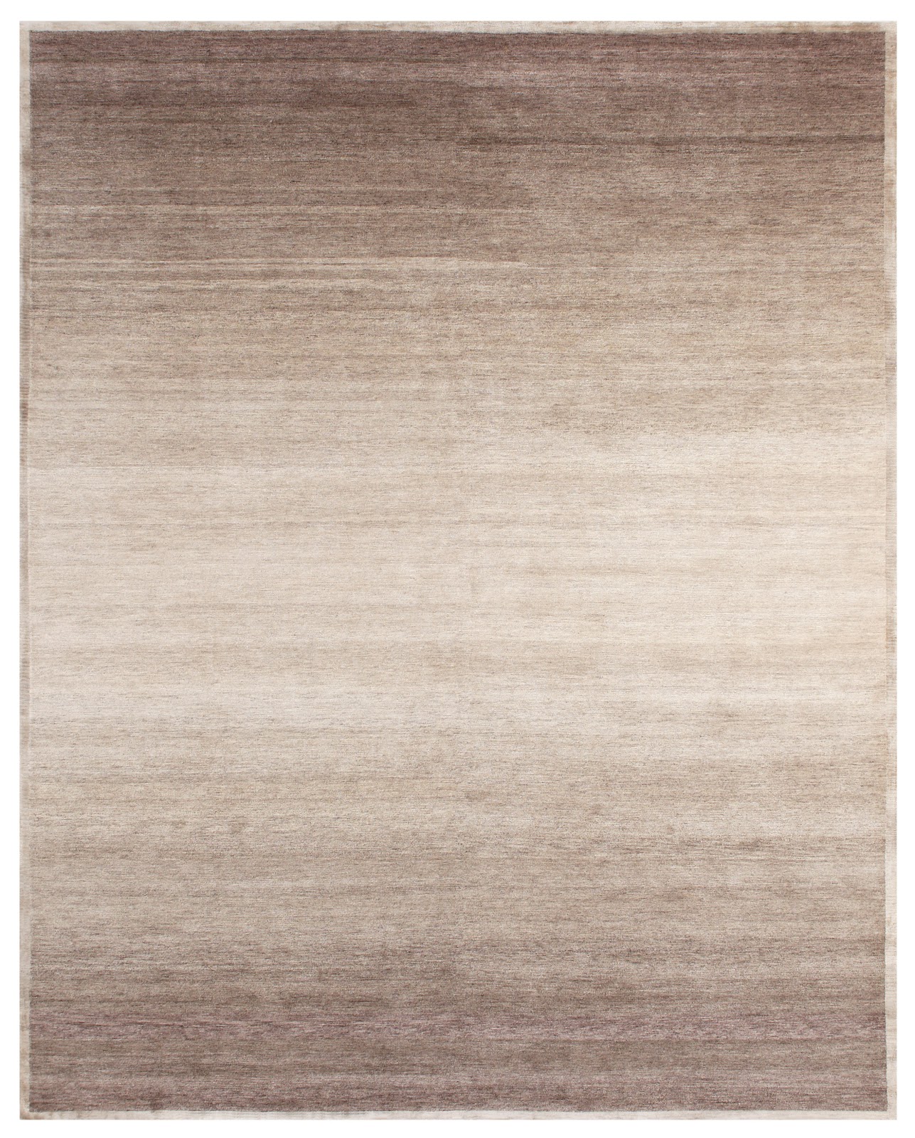
Shades from Wool and Silk shown in colour Silver.
Lapchi
My appreciation for carpets is usually centered around one of two (2) areas of interest for me; Things I like and things I don’t like. Lapchi is a thing I like, for things I don’t like, read the next section. I also like subtle carpets and I like bold carpets. I like colour and I like colourful. I dislike beige (not this $###& again) and so it will be a bit of a shock when you see this:

Axiometric by Lapchi shown in colour Oat/Wet Sand
Axiometric (or Galileo as I was told at NYICS) is a beautifully designed and executed carpet from Lapchi, one whose design has the ability to work both as a tonal rug (as shown in “beige”) or as a vibrant mutlicoloured masterpiece (or so I imagine). Not only would I like to see this design rendered in a deep rich greenish grey – to mimic the look of an inlaid stone floor, but I would also like to see it with fifteen to twenty (15-20) saturated hues, the design outlined in cream creating a near garish carpet reminiscent of the ceilings from which this is surely inspired. This versatility is what I like most about this design and which – for a company specializing in custom made – has to bring added value to those who purchase it for sale.
Continuing trend or has it jumped the shark? You decide.
I remember the very first time I saw an overdyed older persian carpet, and I’ve mentioned it here before, but for those of you unfamiliar: A few years back I was leaving the Metro Market Week Dinner and meeting up with a friend for a few (more) drinks and as we walked past the windows of ABC Carpet and Home, there they were. I was struck by the beauty, the innovative use (of stale inventory), and the general beauty of them. The same is true of when I first saw a patchwork carpet. I love how it can take the serviceable sections of worn carpets piecing them together to create something of newfound value, and as a contemporary rug it pays homage to the under appreciated (in my opinion) panel bakhtiari. Frankly, these are elegant solutions to real problems facing the world of rugs.
Of course it was not long until patchwork hooked up with overdyed and spawned the overdyed patchwork carpet. Again, inherently not a bad idea. Overdying a patchwork allows a producer to combine fragments that may not share a cohesive colour palate, and thus increases the number of patchwork carpets that can be made. One could also argue it allows for a lazy uncreative less artistic approach to patchwork composition as colour is no longer of any real concern, but the two (2) are so interconnected we’ll just chalk it up to the former as I’m feeling rather gregarious at the moment.
But then along came the spider, and it “all” went to crap. Producers looking to cash in on the trend(s) of overdyed, patchwork and overdyed patchwork, but without inventory stocks of their own – in either stale old inventory or fragments – decided to start making things anew. Vulgar ugly new carpets to be overdyed, and carpets solely to be used a fragments started rolling off the looms, and with them so too did the beauty behind the carpets’ original concepts become bastardized.
And just when you thought it could not get any worse, along comes machine made knockoffs, replete with fake stitching to hold the imaginary pieces together, and that dear readers is an abomination.
So, if you want an overdyed, patchwork, or overdyed patchwork carpet, and there is no reason not to want one as they are beautiful, just make sure you get one that is made of stale inventory, or genuinely worn out carpet fragments. Otherwise you are just creating more stale inventory and encouraging a further decline in creativity and originality in the rug industry.

Selection of Patchwork Samples from Creative Touch
Photo Courtesy of Rug News and Design
**Note: I would like to add that I had to borrow the image of the Creative Touch samples as when I visited “The Rug Show” no one was in the Creative Touch booth and I did not want to intrude without an invitation.
Lot’s of great things eh? Enjoy as always, thank you and good bye.