
The appreciation of capital ‘A’ Art is rightly very subjective, certainly not without controversy, and most definitely variable with time. What is hot, hot, hot now may be cold, cold, cold as soon as tomorrow. For me, artistic expression – in its various forms – succeeds as Art when disagreement, indifference, and lively spirited conversion dominate the discussion of the objet du jour. Take for example the fantastic irreverent and intellectual conversations presented in Episode Seven (7) of Season Two (2) of Mad Men as they discuss the recent fictional acquisition of the work of Mark Rothko.
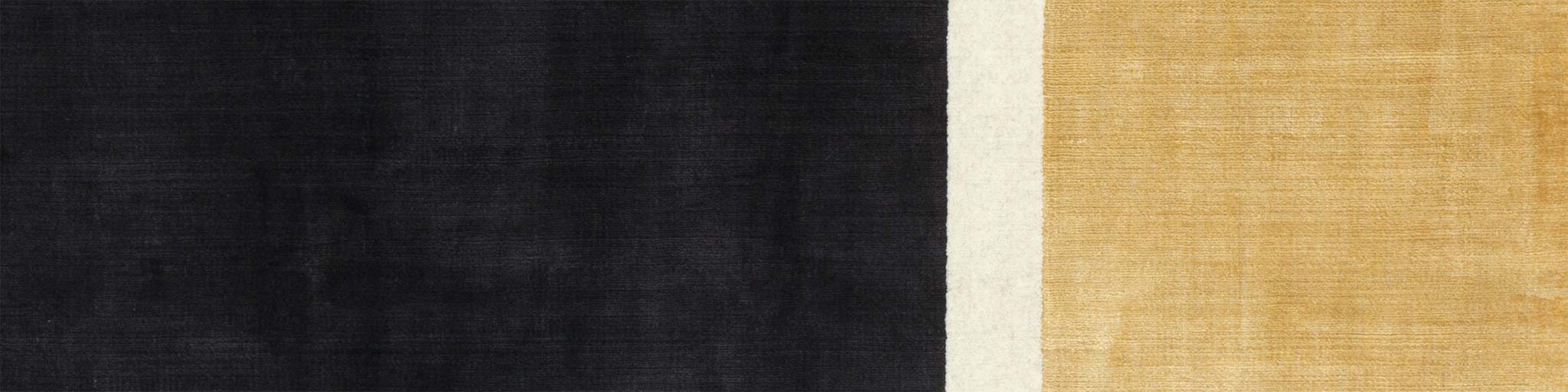
Everyone is a critic and everyone wonders what the owner ‘sees’ in the work when in truth, it is ‘none of their business.’ We consume Art because it speaks to us on some level and the carpet ‘RUGTHKO’ as designed by cc-tapis for ‘10 by YATZER‘ – so named to honour the tenth anniversary milestone of the online design firm YATZER – caught my attention because of the paronomasian word play associating the well known and widely collected artist with a carpet, simple in design.
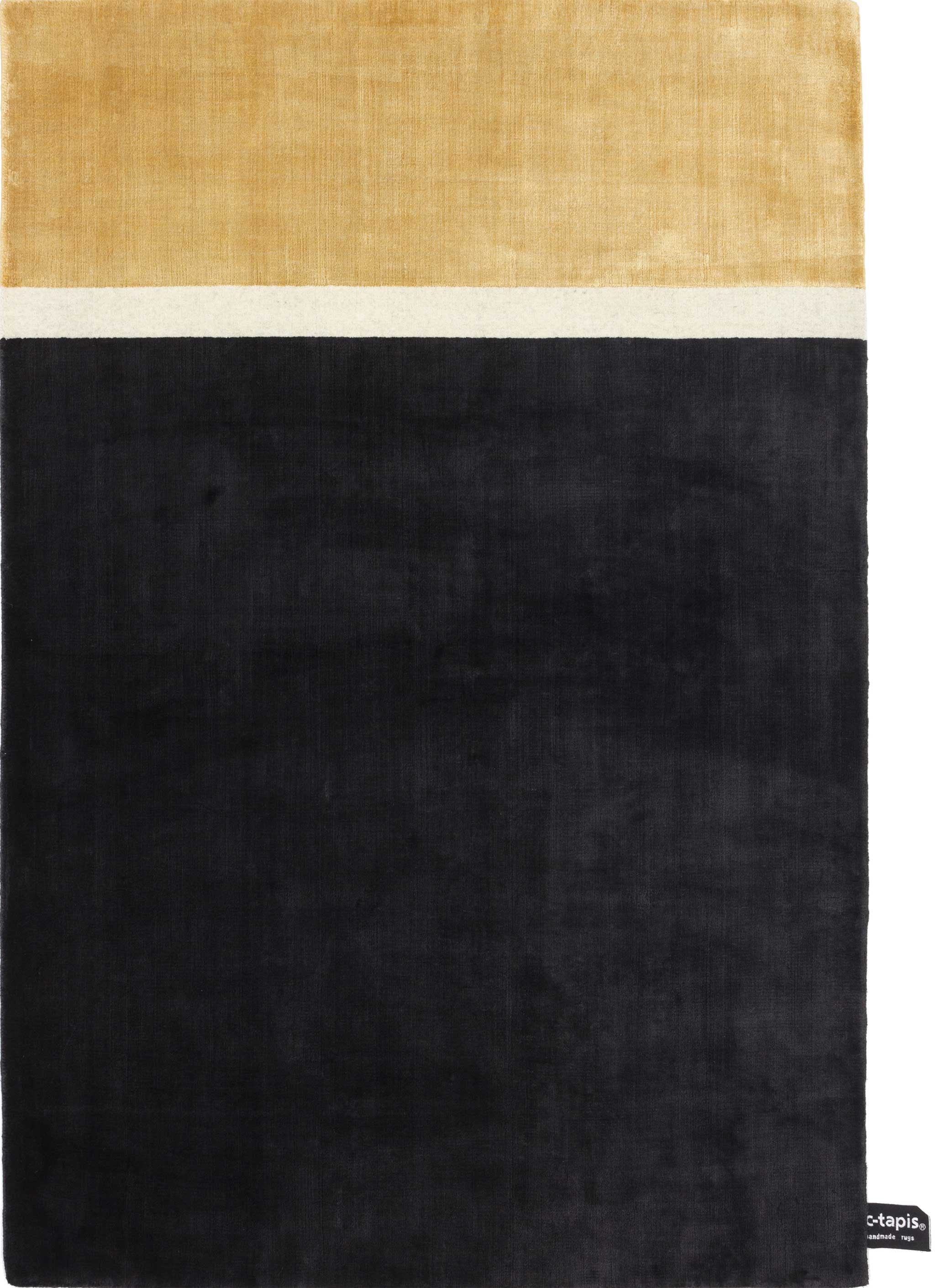
Critically speaking, this is not innovative carpet design in the strictest sense. Solid colour, plain field carpets have long existed in the contemporary market, and while the strategically placed bands do remind of an elegant two (2) colour couture dress drawn shapely at the waist with a white band, the colour palette is nothing if not staid and tired. Twenty (20) years ago when I first started selling rugs and carpets black and gold was the supposedly ‘classy’ colouration one would use to evoke style and elegance, and I sold many so coloured Pakistani 16/18 quality rugs to aspirational consumers during this period. This is not to say it’s a bad colouration, just in my personal experience it reminds of suburban women wishing their homes were far more cosmopolitan.
That statement is of course the wild success of this piece. I don’t care for it for my home, nor could I imagine purchasing it, yet here I am marvelling in its creative use of word play, colour that works to convey an aesthetic, and sizing that all but says: ‘Hang me on the wall and ask your friends what they think of me!!’ For a carpet made as Art I can think of no higher praise than for it elicit the same sort of discussion as a genuine Rothko and its ‘fuzzy squares’. Kudos to a job well done.