
The idea to discuss colour comes from one of my readers. If you have a topic upon which you’d like to read my opinions, please let me know. I may just decide to write about it!
May I buy you a drink?
To quote my good friend and colleague Nedret Gürler, “It’s like being at a bar, Colour is the attractive man (or woman depending on your interest) across the bar. Colour is what makes you want to go find out more. Design (or pattern if you’d rather) is like their personality. The more you get to know them, the more you may or may not like them. So in a carpet, the more you look at a design the more you may or may not like it.” This is the best analogy of colour and design of which I am aware. Nothing else has ever made the relationship between the two as clear, nor as easy to express. The complexities of this relationship are, of course, like all others and go much deeper.
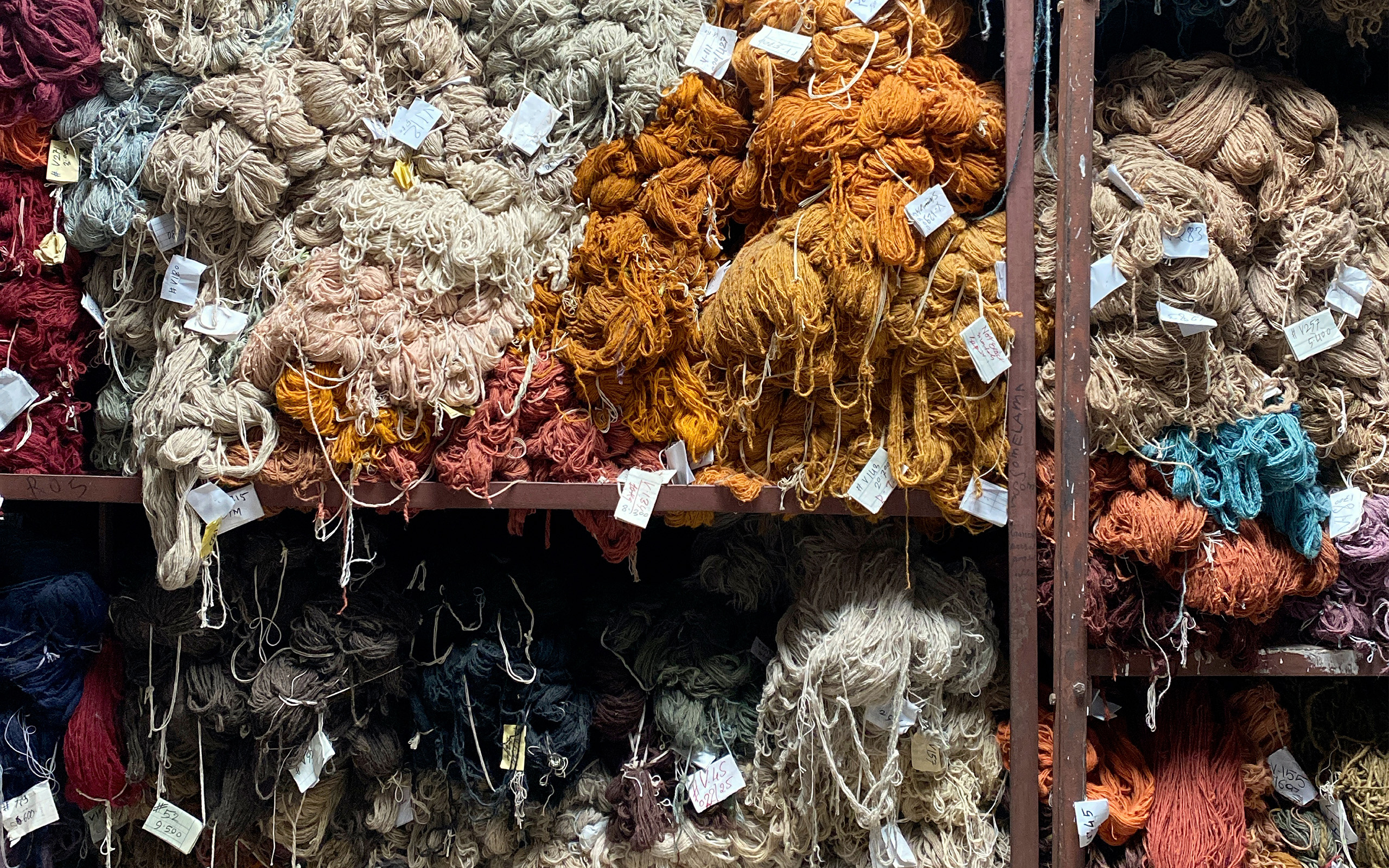
It’s a fascinating study in Beige.
I recently wrote that I feel Afghani and Pakistani production are too heavily weighted toward beige and with certainty made the negative comparison to broadloom, while acknowledging that of course, beige – in broadloom particularly – sells. (See this previous post of The Ruggist) Some may think this to mean I have an overt aversion to beige, and to some extent I do, but mostly my deeper aversion is not toward beige itself, but toward its implementation. “I want beige because it goes with everything” has been uttered by countless consumers, when in fact, it is not going with everything (presumably meaning every colour), rather it is going with, yes, you guessed it, more beige. It is that overuse and dare I say fear of colour that I dislike, and frankly what has given beige some of the bad reputation I’ve cast upon it.
Now in TECHNICOLOR*
In the same post in which I lambasted beige, I was also critical of New Moon for some of their recent colour choices, referring to them as, oh how did I say that, “off the mark”. But how, exactly, were they off the mark? It’s not as though the colour combinations were especially hideous or poor selections. In fact, some were and are quiet appealing. However, they were and are combinations without broad appeal. Broad appeal equals salability. Now, the last time I checked, most of us were trying to sell not one rug, but many rugs, and thus the need for broad appeal. One combination in particular which remains with me was a sample with a grebluvey** field and a near fuchsia design. Do I think that combination has wide appeal? No. Do I think others think it has wide appeal and will use it? No. Did it stick out and catch my attention, stay with me and make a lasting noteworthy impression, and make me look closer at a classical design I may have otherwise overlooked? Yes. And frankly, that may well be the point.
About that drink…
Returning now to the seemingly forgotten bar scenario, what does it all mean? For arguments sake, I’ll continue the analogy with some dating related lines:
1) “It’s always the quiet ones” – Referring to the beige carpet. Although it may lack that “sexy” come talk to me appeal that I apparently want to have in a carpet (and in life?), the colour may be masking a complex, beautiful and intricate design, worthy of note and appreciation. In this case the carpet alone may not sell itself. A good designer and a good salesman though can lead a customer to this “average looking man (or woman) with a lot of personality”, with the designer and salesman playing matchmaker if you will.
2) “Dressed to the Nines” – In reference of course to the grebluvey carpet, I must have found it appealing and clearly wanted to go find out more. It has a strong “sexy” appeal. For me the colour in this case served a purpose of allowing me to find out more about a design (or is that personality) I may have otherwise overlooked. I vividly remember – from back in my showroom days – telling a supplier that I did not want to see “any more damask type designs” only to later learn that in the broader market they sell phenomenally well. I was wrong, but maybe it was because my own tastes and desires for strong colour and the propensity of showroom staff to fail to look beyond their own market and rightly so, blinded me to the beauty of designs that are often neutral (err, beige?) in colouration.
Thank you, I’ll have a Gibson.
What does all of this mean though? Just as the Gibson (A proper cocktail made of Gin and Vermouth, garnished with an Onion) is my drink of choice, it is also not the drink of choice for many people. Boring to look at (it’s clear), it has complex flavours (when made with good gin) and a little extra kick with the onion. I first tried the drink as I heard of it in a movie while on a date with someone I was hopelessly trying to woo. If not for my desire to “look adventuresome” I’d have passed the colourless Gibson over for its flashier yet shallow cousin, the “Chocolatini”. That is what all of this means.
Colour is the attraction, the sexy lure. Design is the personality that keeps us around. Good colours on bad designs don’t have enduring appeal, just as bad colours on good designs can hopelessly cripple that otherwise stunning design. In truth, we need a little of both. Some flash, and some class as the saying goes. Sometimes it takes a little dressing up as it were to sell a design, and other times it just takes getting to know the person, err, design, the old fashioned way, over coffee.
*Technicolor is a registered trademark of Technicolor, Inc. a subsidiary of Thomson SA.
**Grebluvey = Green + Blue + Violet + Grey