
It seems the great wave of what would become the current observable trend of Japanese Shibori inspired rugs and carpets was already building when I attended an Art Day Workshop at the Toronto, Ontario offices of Creative Matters in November 2016. Arranged both as part of the firm’s routine design process and as an activity to entertain and inform a guest, it provided enlightening insight into the concept before it began touring at Domotex, High Point Market, and The Rug Show. One piece of the art I created that day was even translated – with minimal design refinement – into a finished rug.
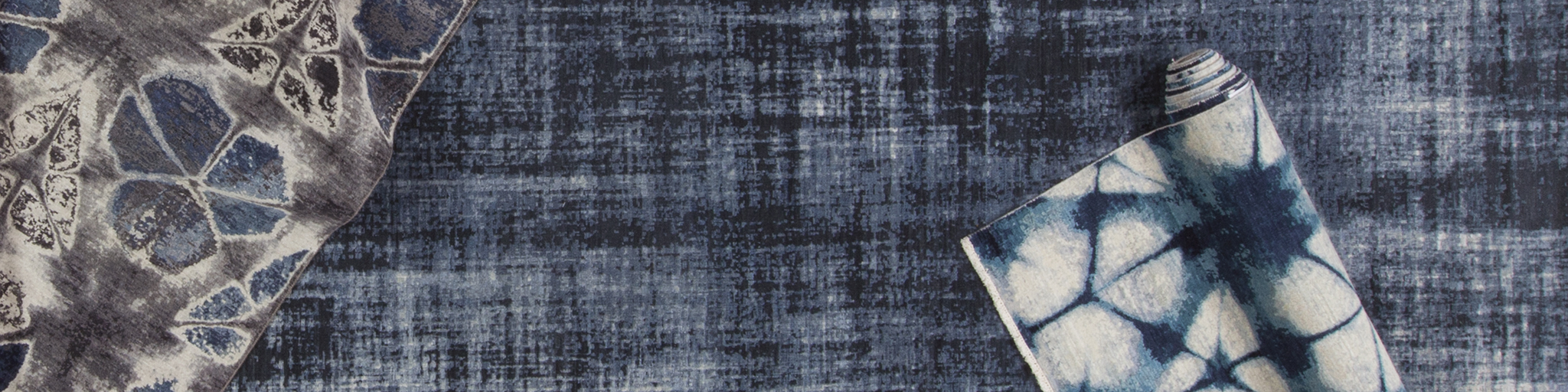
Then in New York during the Fall 2017 instalment of The Rug Show it was as though Shibori style had exploded upon the rugs and carpets of virtually every maker/importer/wholesaler exhibiting, with notable examples from Samad and Zollanvari shown herein. Some carpets were quite literal in interpretation of the aesthetic form, others more inspirational, yet all hinting at a resurgent popularity of Japanese originating influences in design. Perhaps there was more to be considered.
At a casual dinner the following January of 2018, during the annual Domotex fair in Hannover, Germany, over great tasting beer and a meal purposefully devoid of wursts, the personal interests of my dinner companion sparked an idea. ‘I could order some flatweave samples and try some resist dyeing techniques on them,’ he replied to my conceptualization of making rugs and carpets using actual resist dyeing techniques as opposed to merely mimicking them. ‘Do you think it will work?’ I asked already anticipating the response before answering myself in the same breath, ‘I guess there is only one way to find out.’
That is how ‘Shibori Style’ came to be. So without further ado, an exploration of the aesthetic and technique in conversation with Nathan Tucker of Lapchi’s Rug Design Studio in Chicago, Illinois.
[wc_row]
[wc_column size=”one-third” position=”first”]
[/wc_column]
[wc_column size=”one-third”]
[/wc_column]
[wc_column size=”one-third” position=”last”]
[/wc_column]
[/wc_row]
The Ruggist (MC): Shibori and indeed many things Japanese or at least à la façon japonaise seem to very prevalent in the marketplace right now; an observable trend that appeals both to our sense of order and our penchant for beauty in the unexpected. This is nothing new for you however, is it? You’ve been working and experimenting with Japanese techniques of resist dyeing for a while now, haven’t you?
Nathan Tucker (NT): My first attempts were a few years ago. The initial styles I tried were the really easy ones where you use cotton strings or rubberbands and make oboshi rings. I would use a little dowel rod under the cloth and loosely tie a knot around it, then remove the rod and tighten the knot. Making patterns, using different arrays and sizes with those rings is fun.
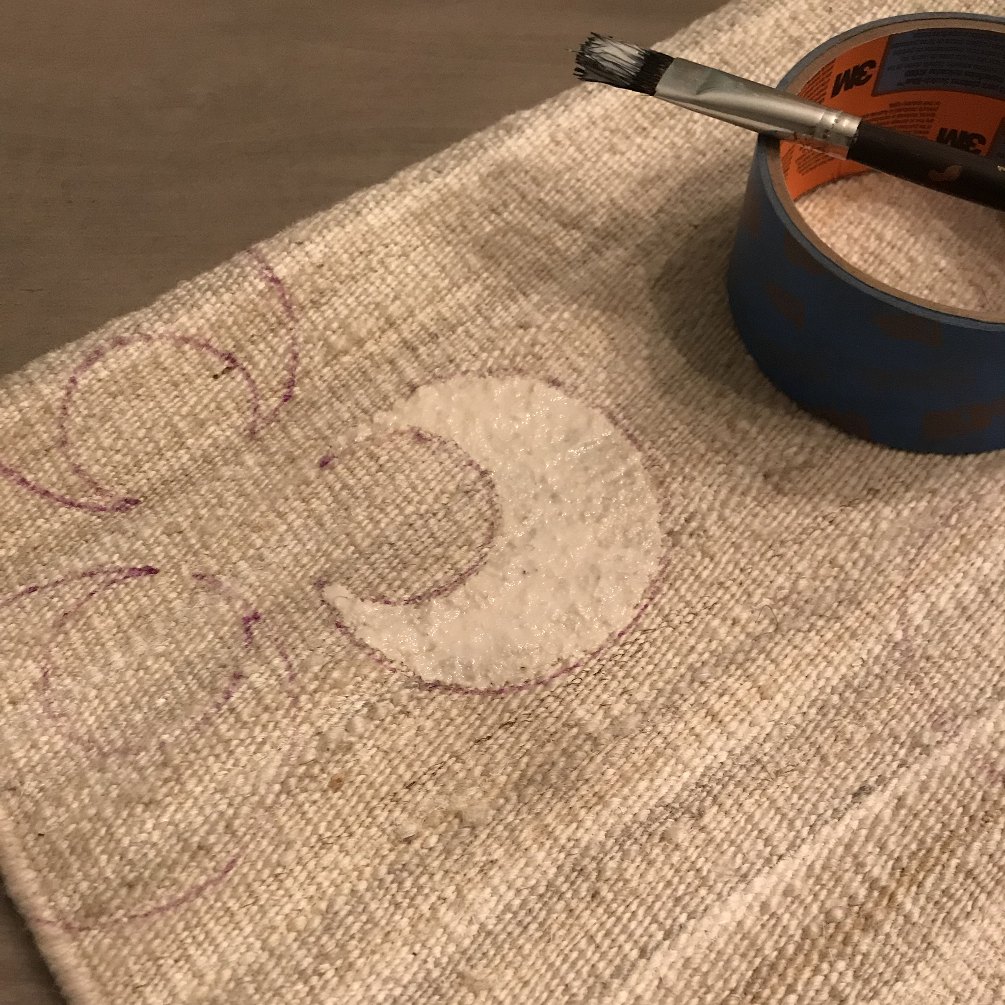
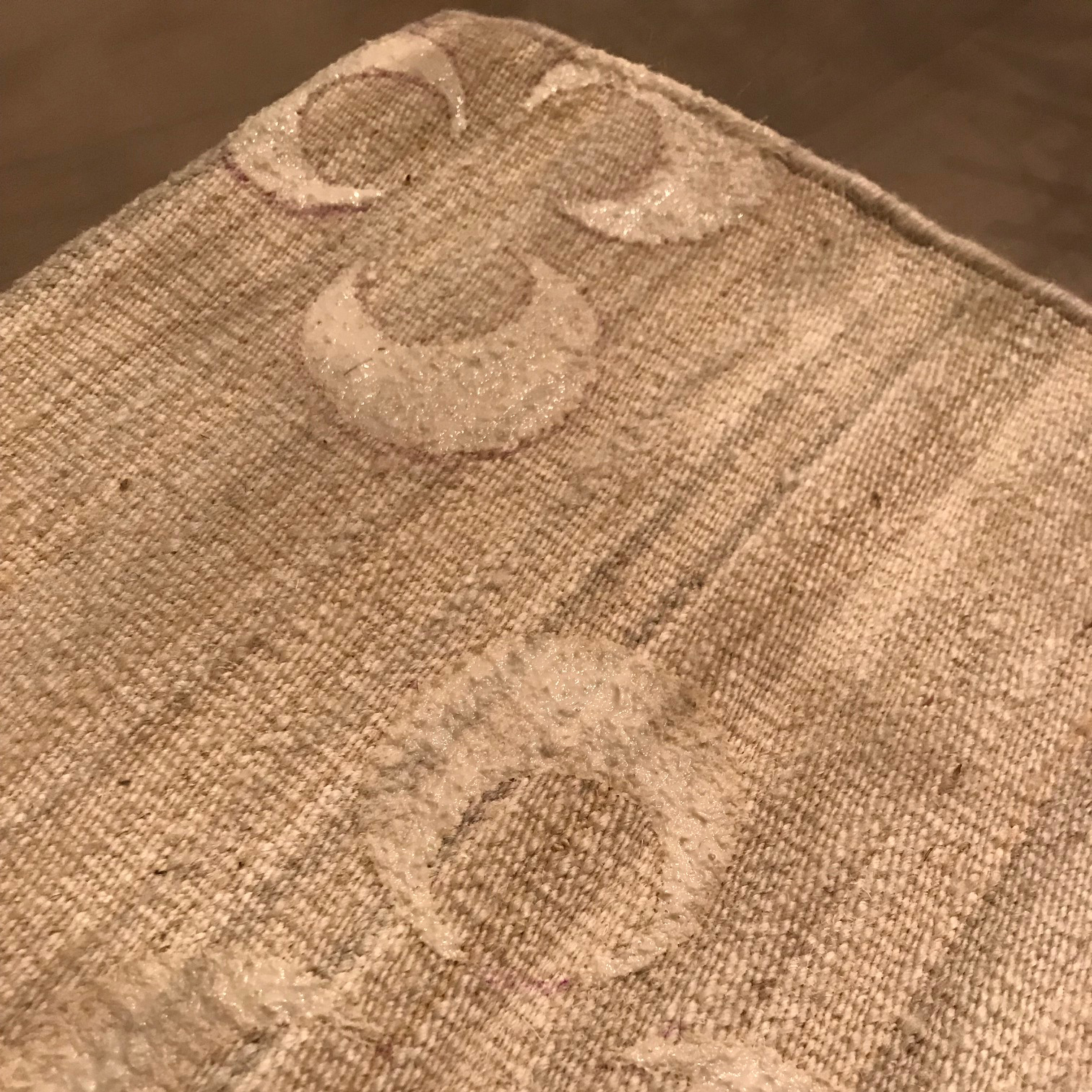
Arashi techniques are also pretty easy and have neat results. In this manner, you’re rolling the cloth around a pole of some sort, wrapping it with some sort of string, and then cinching up the material really tight before dyeing. Nui-shibori is my favourite look, but super time consuming as it requires actual hand sewing. Currently, the majority of my work is using rice resist paste (katazome) as well as stencilling (katagami) to create patterns on the fabric prior to dying. Using varying combinations of these styles can produce some lovely unexpected results, too.
MC: So to relate that for those who may not understand oboshi, arashi, nui-shibori, and the like, basically what we are talking about is a more structured form of tie-dye that many people are perhaps more familiar with?
NT: More or less.
MC: And the resultant patterns on the fabric, they translate well into carpets?
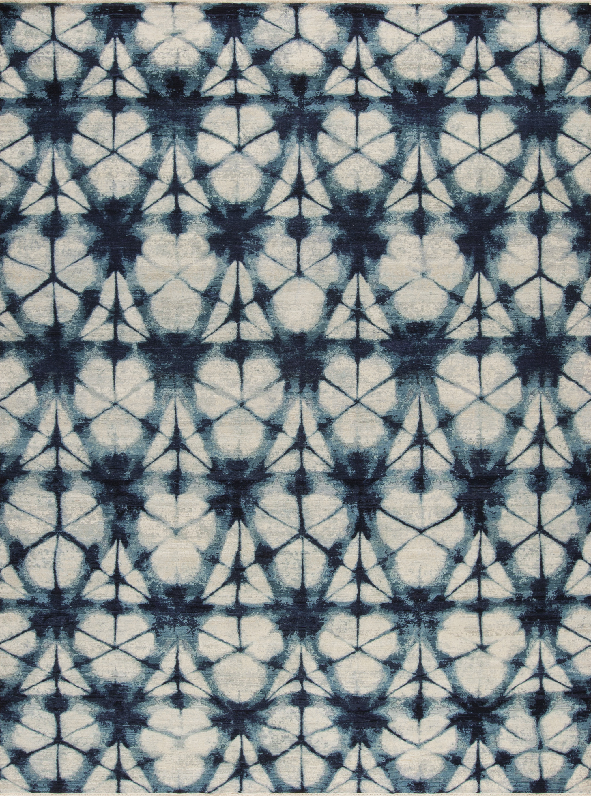
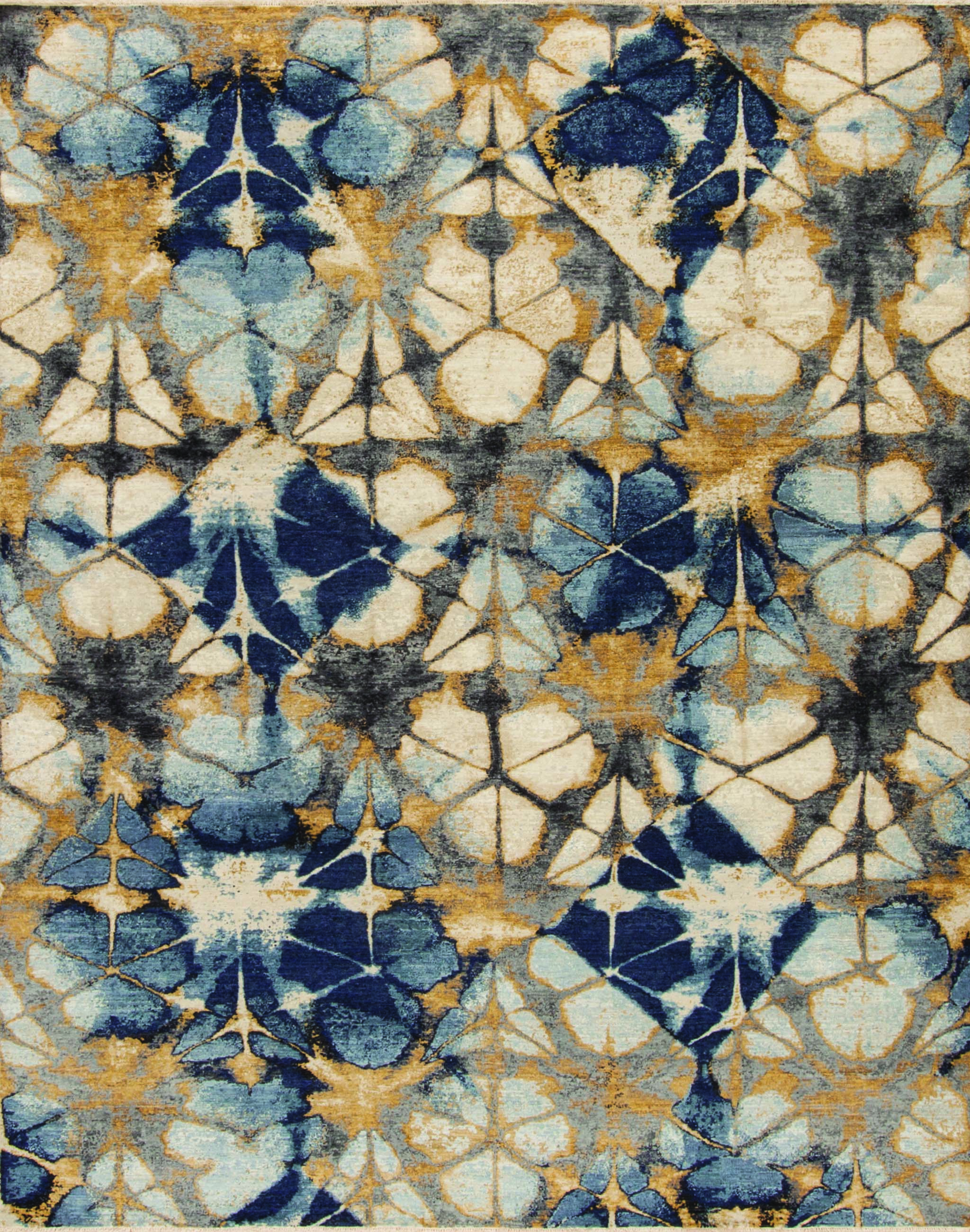
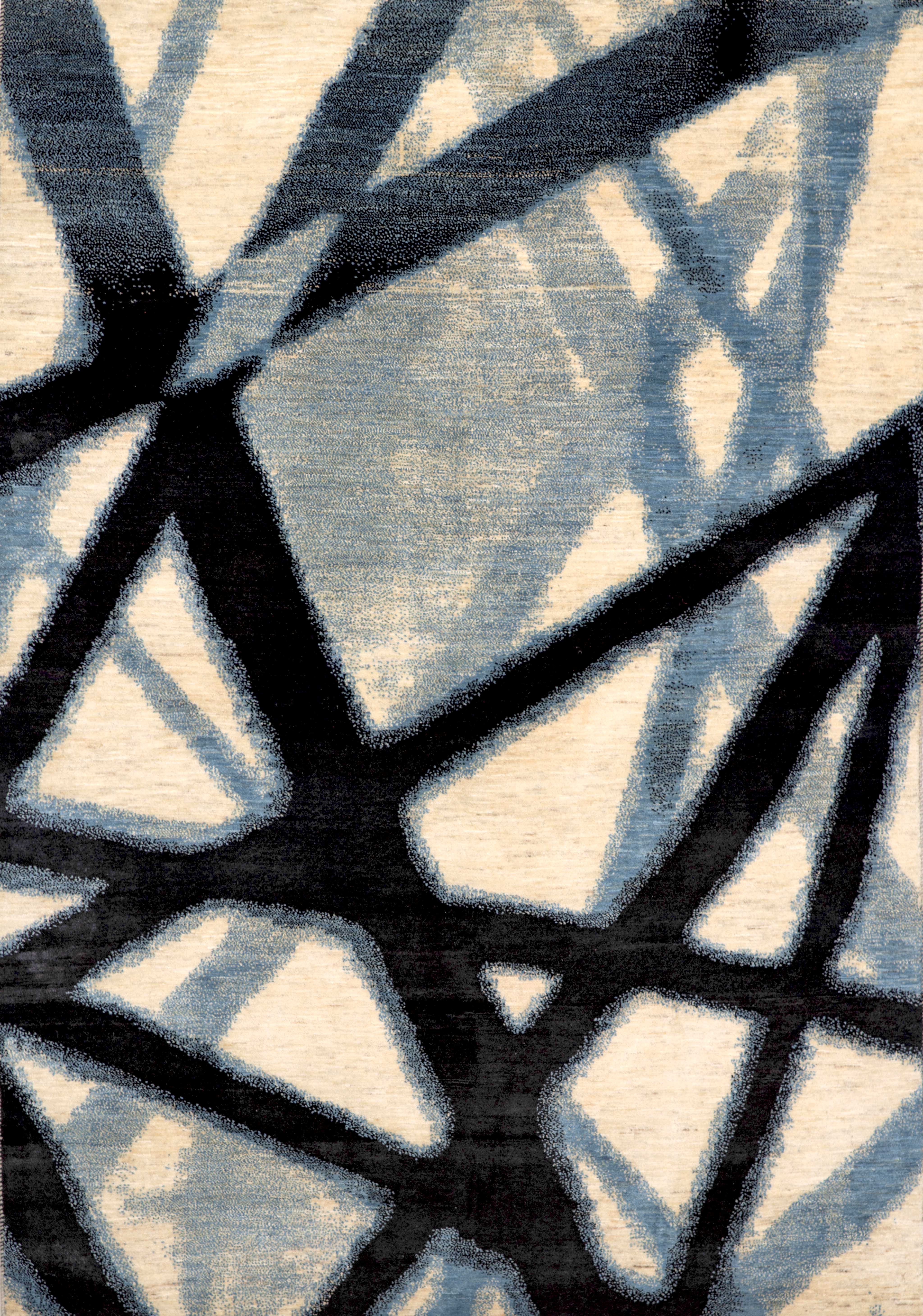
NT: I guess when it comes to reïnterpreting a certain medium or artistry into handknotted carpets, there’s always going to be a challenge, depending on how close of an analogue to the original inspiration you’re trying to achieve. In shibori’s case, the general patterning is something that’s pretty easy to recreate with a graphed knot. Specifically, the itajime technique of shibori is something you see a lot of; the more geometric style of block/resist dying.
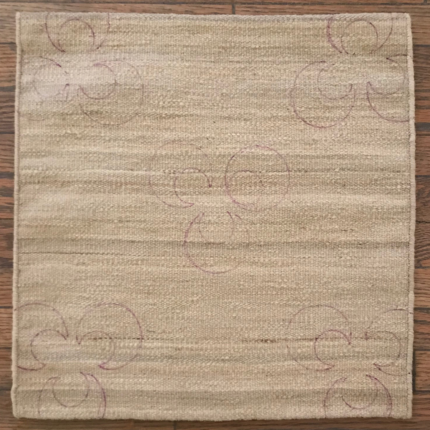
MC: From my own observations of and experimentation with the various techniques I found the myriad colour variations and gradients, while expected, to be most nuänced, often heavily saturated in one area and then ephemerally delicate in another. For example, when I dyed the fabric that eventually became the ‘Ichiban’ carpet from Creative Matters, my folding and dye selections were deliberate with an intended preördained aesthetic, but the exact look was as of then unknown.
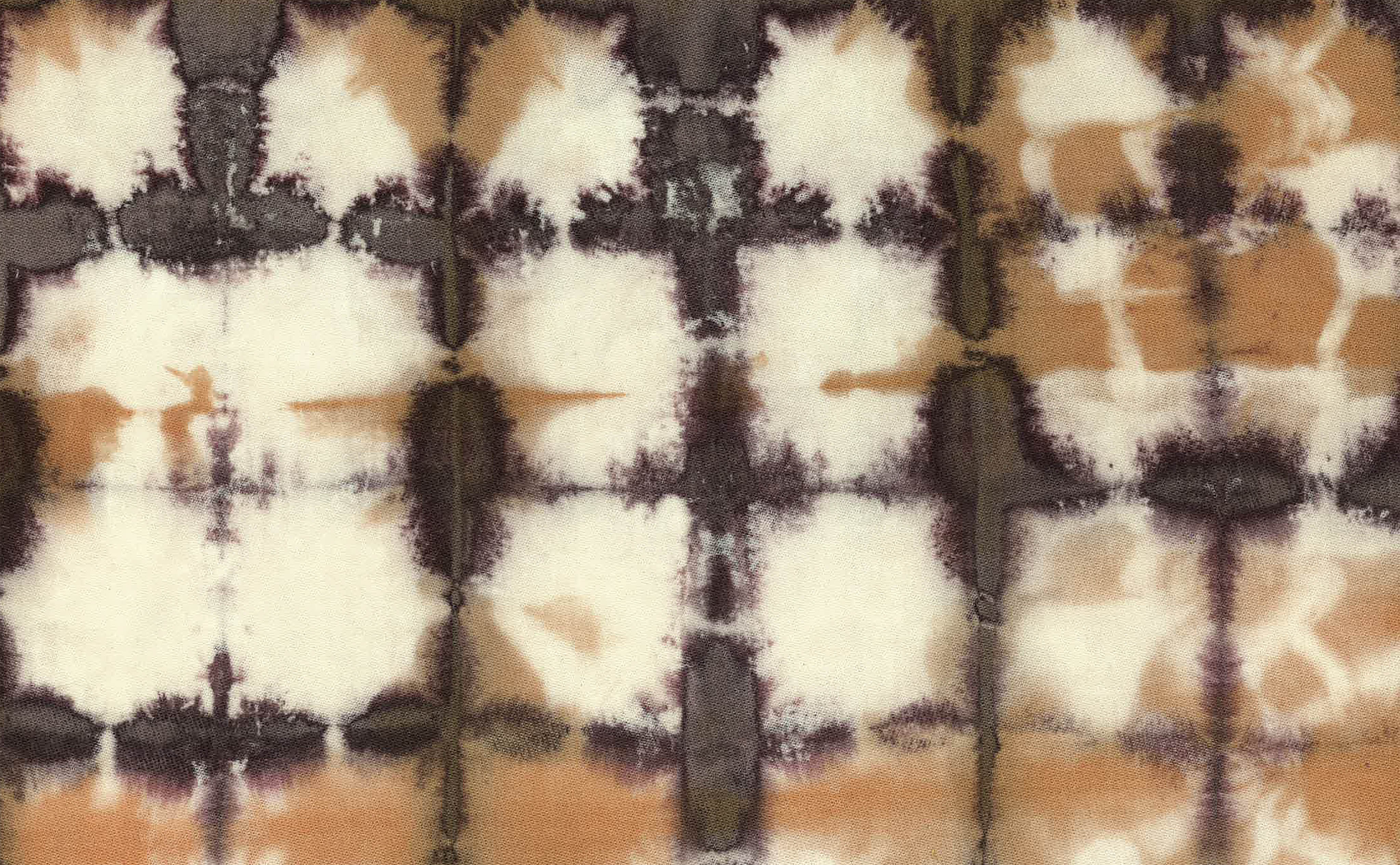
NT: The hardest thing, in my mind, is getting that dye-bleed look. You see a lot of poorly reïmagined attempts, and where it fails a lot of the time is how well the ombre – the fading and bleeding you mentioned – is executed. Getting the saturation to feel ‘real’ or ‘authentic’ to an actual dyed fabric is especially difficult.
MC: Anyone whose carpetry work you’ve seen that really seems to hit the mark?
NT: I think Tania Johnson and Driscoll Robbins have made some really beautiful gradient fading in their work. Additionally, even if it’s not necessarily shibori however, I have to give a huge nod of appreciation to Joe Carini and Tom DeMarco for the indigo pieces they’ve done. Those latter two achieve such amazing colour results, all through an exploration – in part – in vegetal dying.
MC: That sounds like a conversation for you and I to have another time as I am not certain the occasional rug viewer has an eye for the difference between a true indigo dyed rug and one which merely facsimiles the colour.
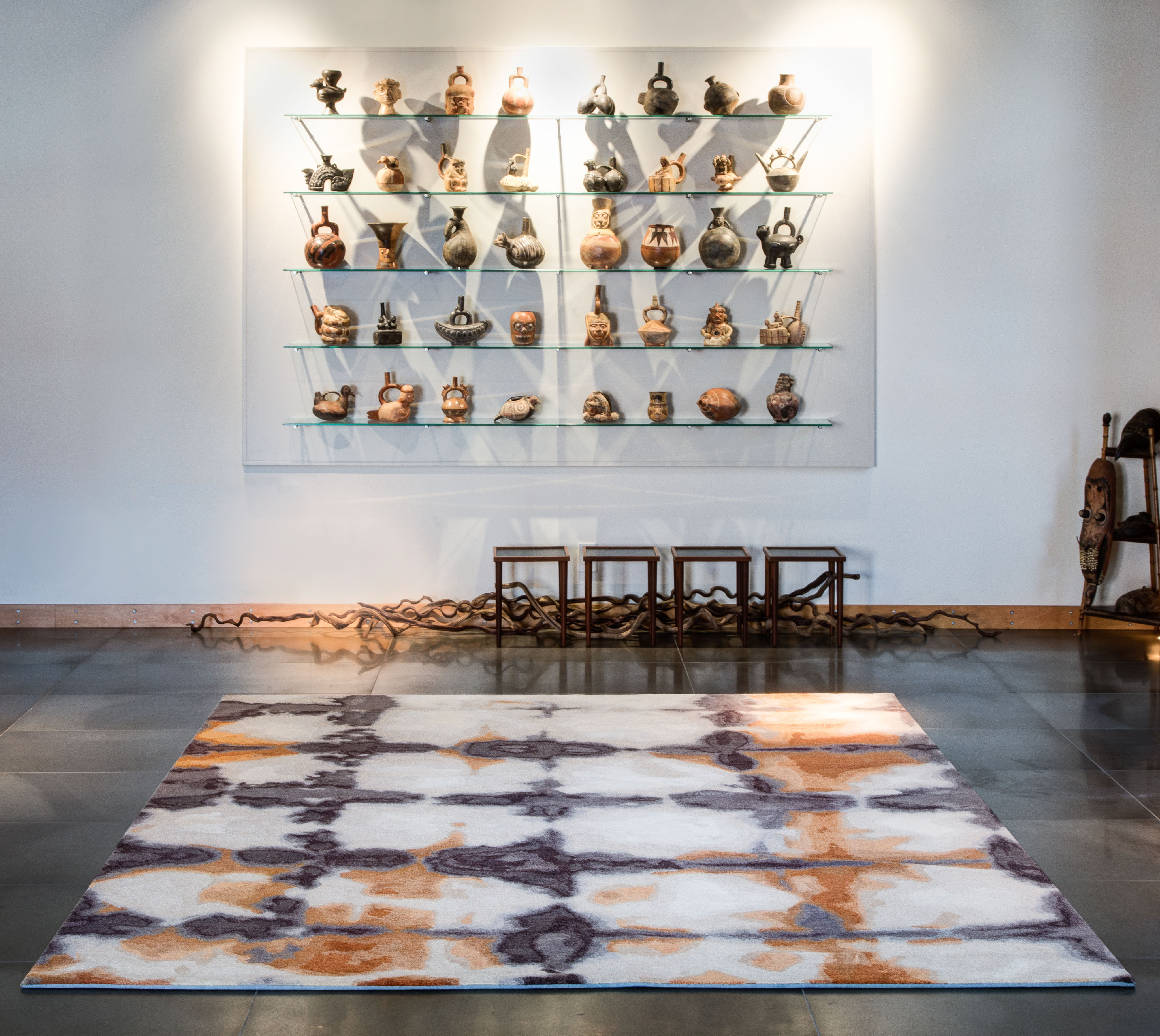
NT: What makes any of these really fantastic is subjective to the viewer I suppose, but there’s a first-take thing that happens for me, and I just know it when I see it. Zoë Luyendijk’s Blots Bottom design is definitely an achievement in that regard for me. I was sort of dumbfounded looking at it, trying figure out how she achieved a finished aesthetic that looks so true to the actual craft.
Tucker had previously mentioned ‘Blots Bottom’ during the dinner that precipitated this exploration and I know he is genuinely captivated by it. In fact, when I contacted Zoë Luyendijk to request an image of the piece for this article, I was asked if Tucker was the one who suggested the rug for inclusion.
MC: I think it was your suggestion to try dyeing rug samples, was it (k)not? What was your initial thought process on this? Fun experiment? Perhaps as research and development (R+D) going somewhere?
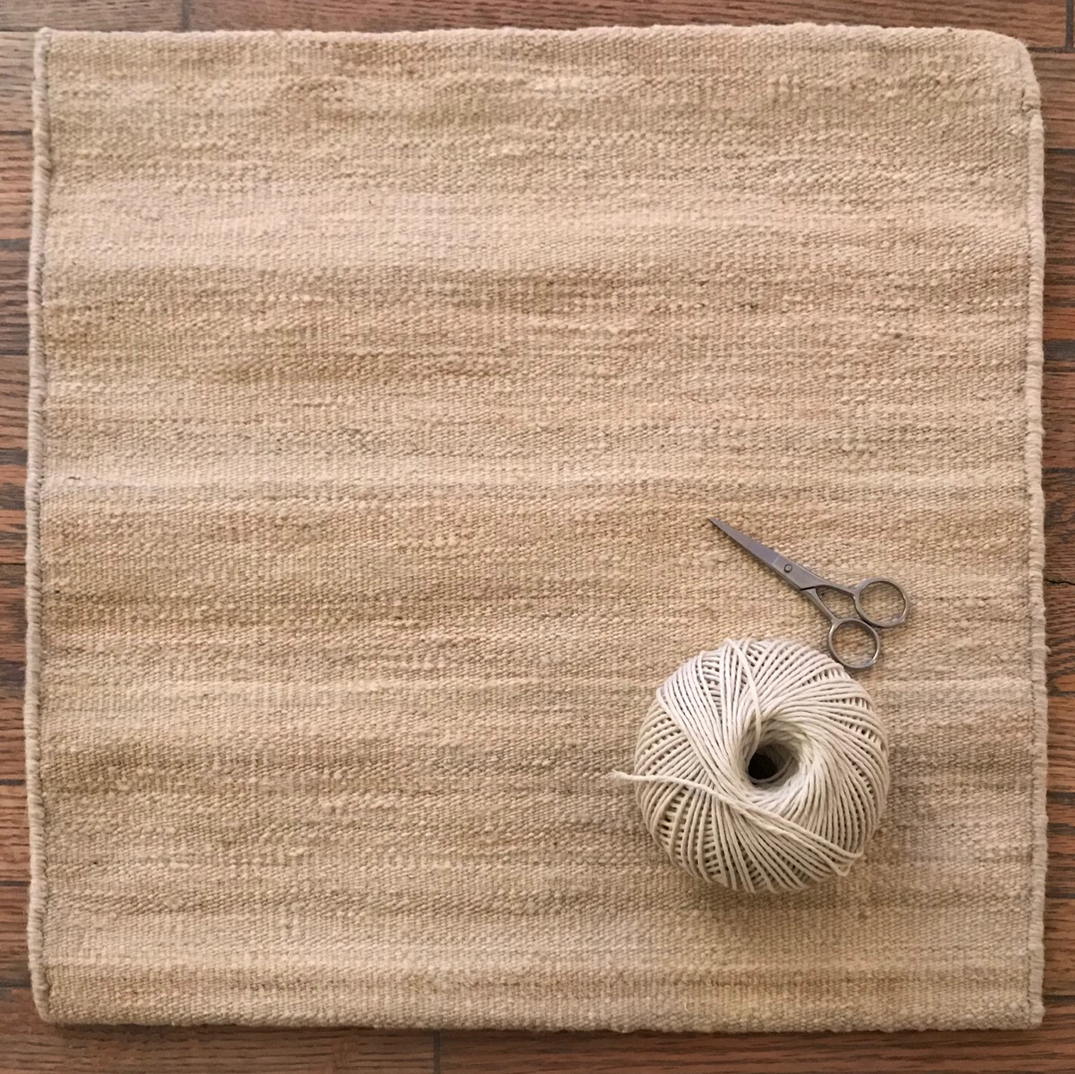
NT: Looking back at some of the Lapchi and Battilossi work with our Pakistani weavers, I was hoping to do something fun with the dyed wool wefting, as well as some resist techniques with the very low-shear pile carpets. The flatweaves seemed like they were going to be a little more flexible (literally and figuratively) to experiment with. I suppose the initial idea though, was trying to achieve the look of shibori via natural means, staying true to the discipline, instead of recreating it by mapping it all. It was then during the experiments that I came to understand how it might play out in real rug making.
MC: Which is to say… ?
[wc_row]
[wc_column size=”one-half” position=”first”]
[/wc_column]
[wc_column size=”one-half” position=”last”]
[/wc_column]
[/wc_row]
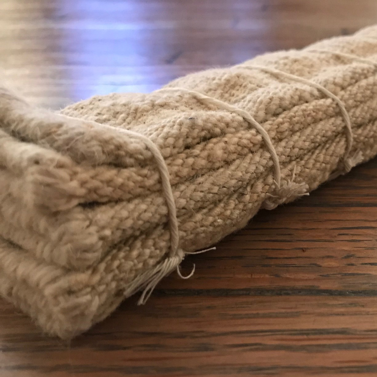
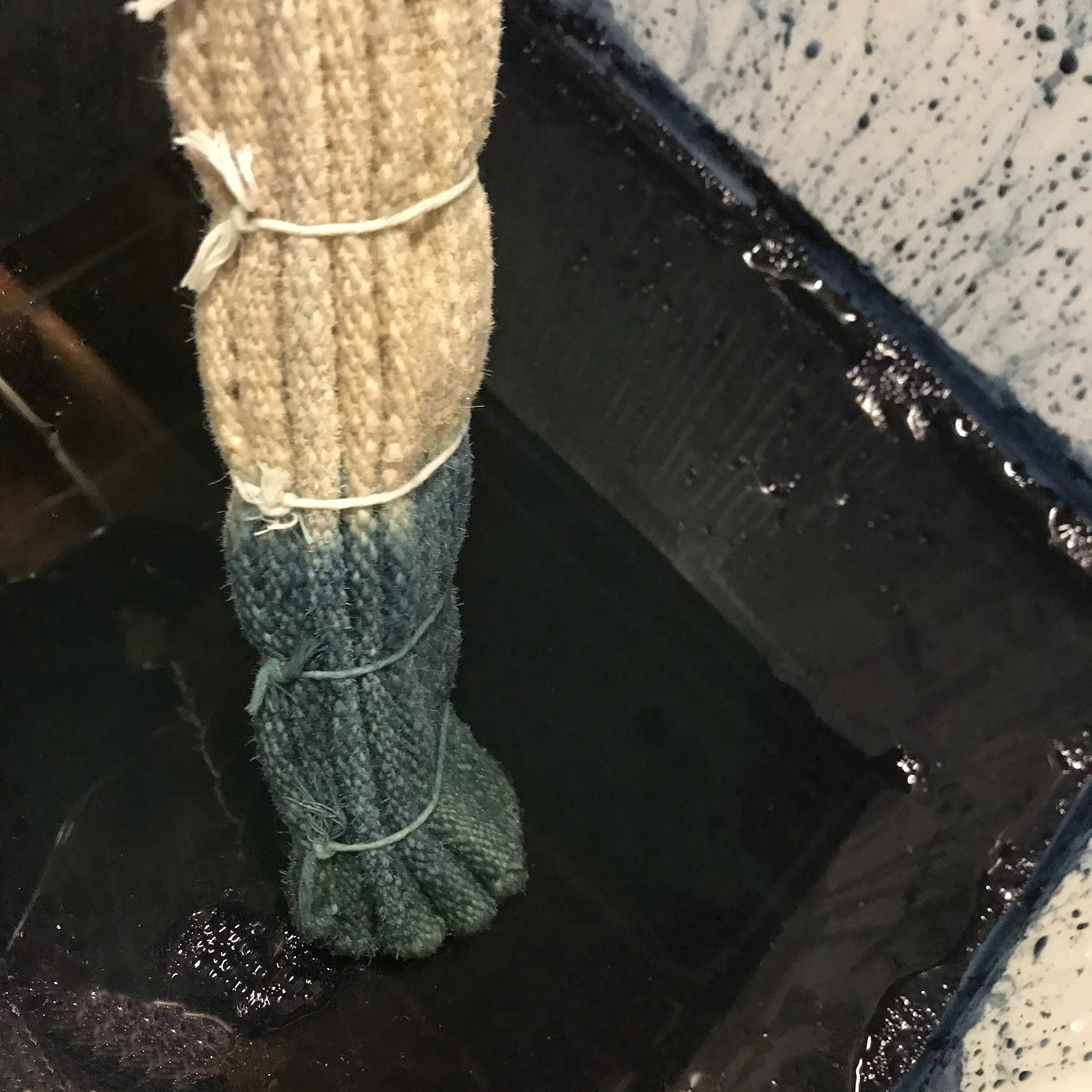
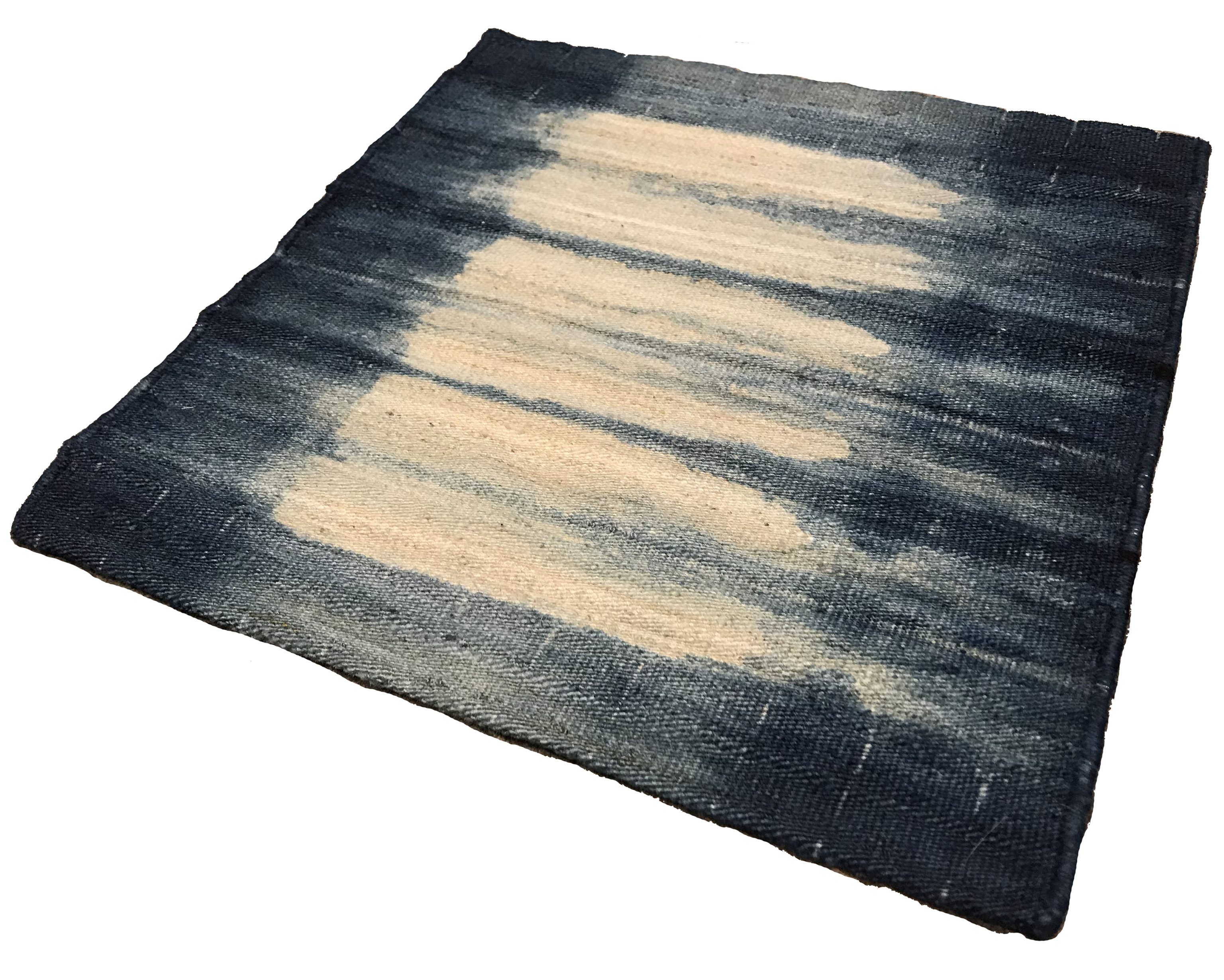
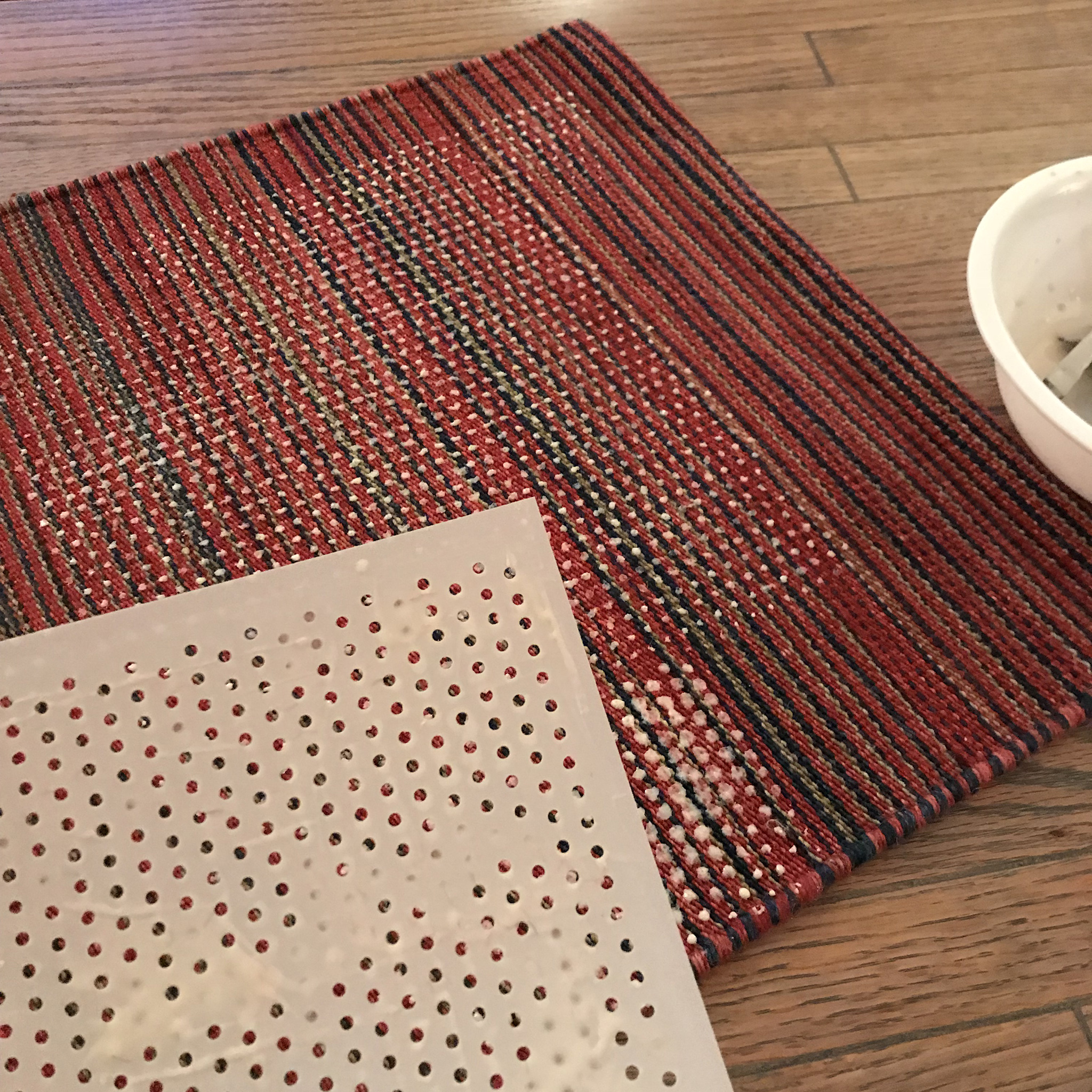
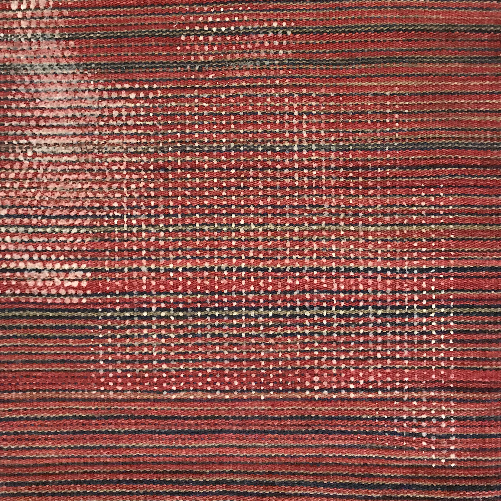
NT: Even though kilims are very pliable and lightweight for a rug, compared to a habotai silk or cotton piece of fabric, they’re insanely different to work with. You really can’t do many of the same folding and cinching techniques with something like a kilim. The one wrap technique that seemed the most doable was an accordion-type fold you mentioned [in one of our chats during the process], and then tying it up in regular intervals. I was trying to do an ombre fade, trending inwards toward the middle from each side. It seemed to have worked nicely. In retrospect, a few more dips would have been better, but not a bad look at all for a first attempt.
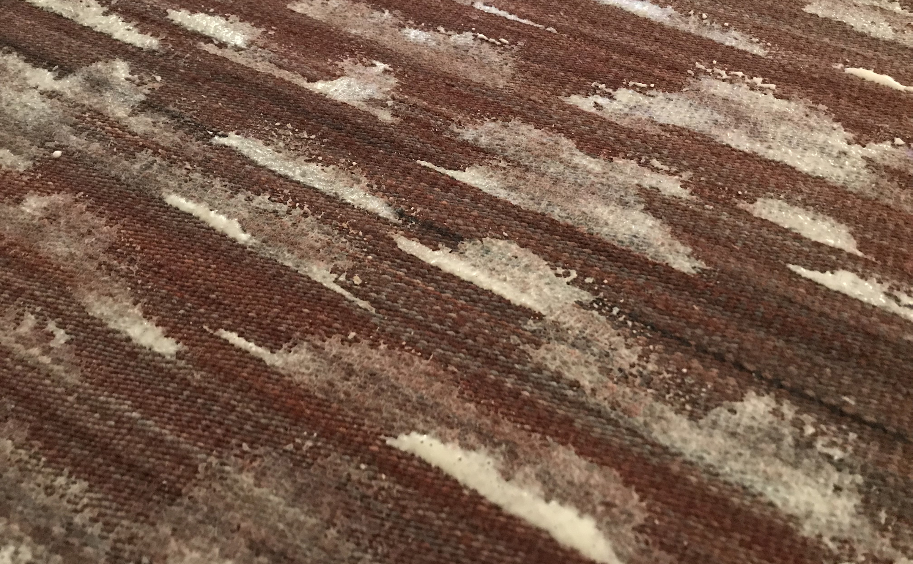
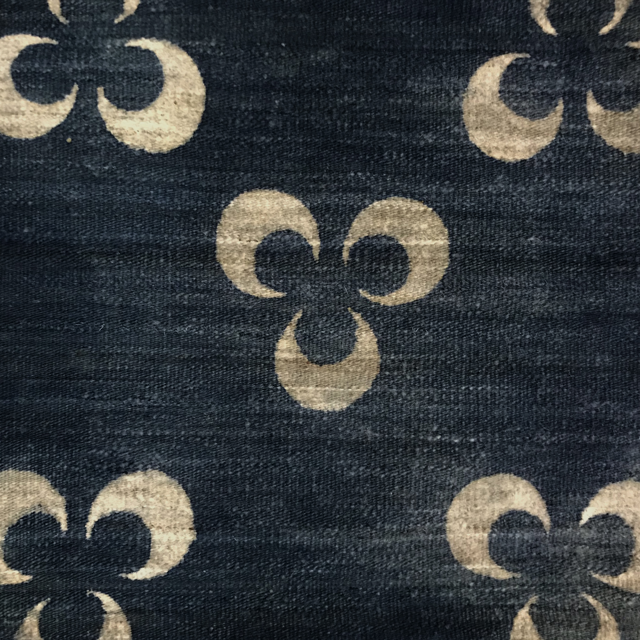
NT: For all the others I chose a resist paste technique. I used a stencil for some but handpainted on a few others. The cloud-like design is something I did previously on cotton and is one of my favourite pieces to date. Your suggestion of a using a çintamani motif was excellent; that was among the best results for sure, and it is steeped in rich rug history.
MC: You are too kind. To be honest I merely selected something easily recognizable and highly regarded. Plus if I am to be fully forthright, I enjoy the juxtaposition between techniques and motifs from disparate (or not) cultures mixed together to create new forms; the çintamani motif itself is thought to have evolved similarly. In a way I guess this is no different than mixing various techniques and dyestuffs within resist dying and enjoying – or not – the results.
[wc_row]
[wc_column size=”one-third” position=”first”]
[/wc_column]
[wc_column size=”one-third”]
[/wc_column]
[wc_column size=”one-third” position=”last”]
[/wc_column]
[/wc_row]
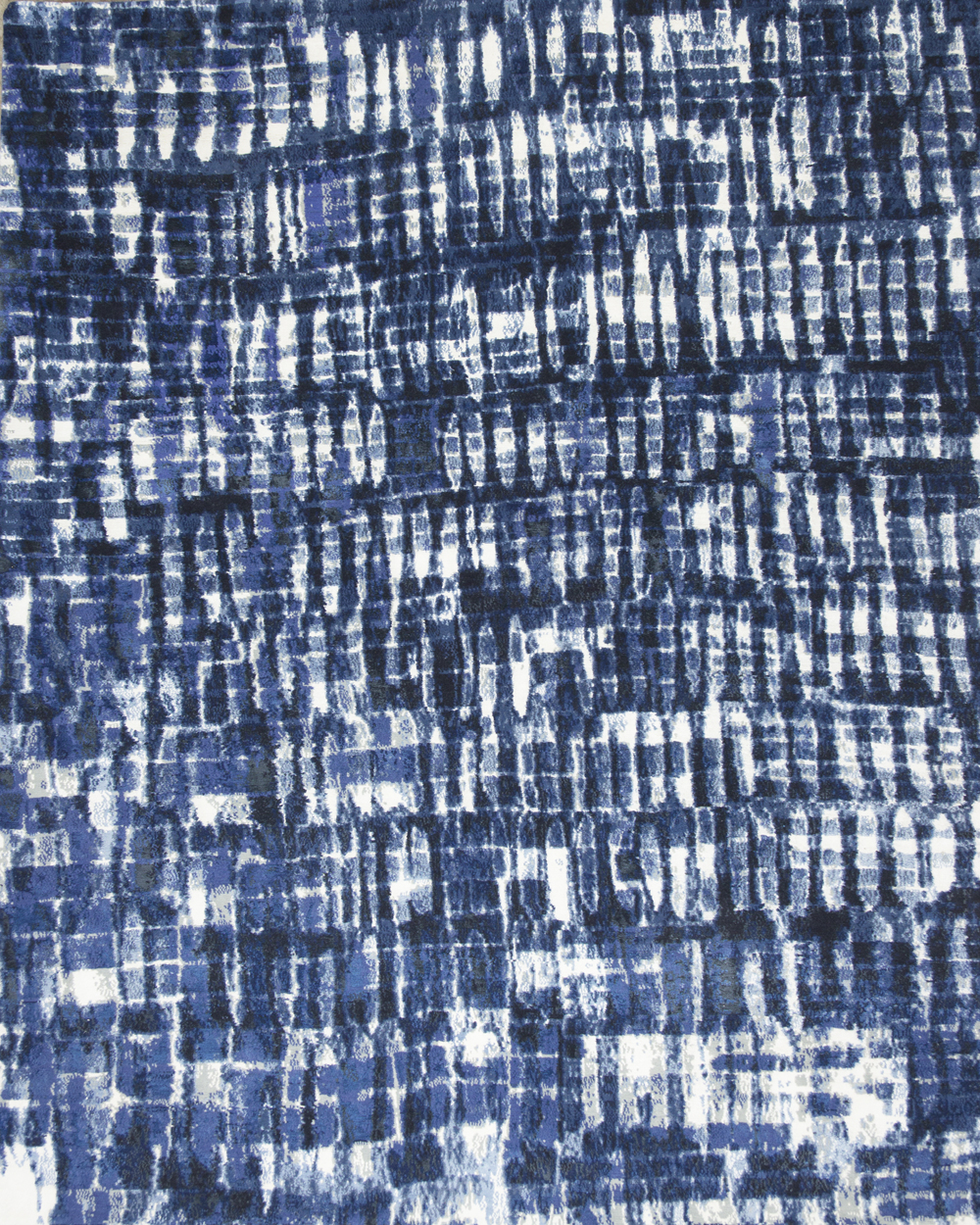
NT: I found that overdying on deeper, saturated colors had nice looks whereas dying over the lightest possible tones yields the most predictable results. For instance, dying on a rich red tone I thought I’d get a super deep purple, but it actually went orange on me; the lime green didn’t go as dark as I’d expected. Overall though, much more experimentation would be needed, with more scientific means than my basement can provide! A different resist solution that washes out easier than my paste would also be a bonus. In R+D terms, if we were ever to really give this a run it would be really nice to work side-by-side with our factories and ‘dig deep’ in an exploration of further possibilities. I chose to just try a few things on my own without really speaking to any of my colleagues in Kathmandu, Nepal, as it was just some fun experimentation.
MC: If I may interject, I find sometimes it is best to try things with a degree of willful ignorance or perhaps better said, naïveté so as to avoid the expectations of tradition. But I’m sorry, I interrupted, please continue.
NT: But, as I did these pieces, I was also trying to factor in the practicality of doing the work on a full-sized rug and not 18″ x 18″ (46cm x 46cm) samples. I ran some questions by one of my really talented colleagues in Kathmandu, Passang Dorjee, to get his thoughts and feedback. He liked the results and commented that, in theory, it’s totally doable. The biggest challenge would be the vats, as they would need to be large enough to accept a whole rug. There would certainly be some necessary experimentation in order to get the process down.
While conducting field research in Kathmandu in December 2018, I had the opportunity to meet with Passang Dorjee and spoke with him regarding the experimentations Tucker had conducted. ‘There is great potential in the technique but it has not been explored. The fanfold kilim is great,’ stated Dorjee. ‘We experimented similarly a few years ago. The results were beautiful but perhaps the technique is too time consuming for widespread use.’
Dorjee’s comments reveal the commercial side of the craft of carpetry which requires that a rug or carpet not only be visually pleasing but also produced in a manner in tune with current consumer trends, needs, and wants. So while the aesthetic of actually dying a rug as opposed to just mimicking the look may be subjectively superior in an intrinsic sense, the additional manual labour (folding, dying, drying, et ceterta) added to an already labour intensive craft (handknotting or handweaving) is not necessarily justified when the look can – with proper execution and design – be well duplicated simply through weaving and knotting.
[wc_row]
[wc_column size=”one-half” position=”first”]
[/wc_column]
[wc_column size=”one-half” position=”last”]
[/wc_column]
[/wc_row]
MC: That reminds me. You were doing some experiments on pile carpets as well weren’t you? The flatweaves look great, how did the pile carpets turn out?
NT: Oh man, the pile experiment was a total disaster. I think I had mentioned it might sell well at road-kill inspired taxidermy shop. All hyperbole aside, I attempted to do some clamping in order to get a stripe pattern. It didn’t hold back the dye very well, but the bigger problem was how the dye took to the wool overall. I would also guess that in a full size, the carpet would be insanely hard to handle while dying. Not only the weight, but the overall awkwardness. On the other hand, the kilim worked great, and I imagine other thin loop constructions like a soumak would work ok as well.
MC: So what I’m hearing is that the pile carpet is a non-starter and the flatweaves have promise. But is that commercially, artistically, or otherwise? In my own admittedly limited experience with resist dyeing I found the structure of the technique to be very comforting. The results – while somewhat identical – varying slightly piece to piece with some more appealing, for whatever reason, than others. I see similarities between producing multiples of a resist dyed textile or rug and that of older rug production. For example look at an old ‘Heriz’ of which there are ample; each is different with discernible variations but overall it is still clearly a ‘Heriz,’ with the same caveat regarding relative aesthetic appeal. Most modern rug production has done away with this variability between individual carpets, and I wonder is that good or bad? Personally I favour a bit of the unknown, but I guess this is no different than the debate between hand drawn versus computer generated weaving graphs. Minor variances and such… .

NT: Super good point. In a lot of ways, especially factoring in our clientele’s expectations, it’s tough anymore to sell them on the one-of-kind aspect of anything, unless we’re discussing an existing rug. Everyone sort wants what they want, you know? It works in a found piece, but for a rug or carpet ordered to custom specifications, I think a very straightforward conversation would be necessary as to what sort of parameters they (the designer and/or end-client) would be comfortable in sacrificing. Which elements would be controlled versus uncontrolled? And what of the result? At Lapchi, the closest example would be using some extra variegation in the dye process, to achieve a lot more character in the yarn’s hues and depth of colour. We’re at the mercy of not only how the colours’ tones and depths express themselves, but also how those dyed yarns then play out during looming. The wabi sabi aspect of true shibori is definitely a large part of the appeal though; every piece has a little bit of its own identity.
MC: Right? This is a question I often ask myself while listening to a fellow rug aficionado ramble on – as I do – about doing ‘everything by hand.’ How much hand, in both a literal and metaphorical manner do we accept? Factor in the modern era of ‘experiencing’ the world through a flat textureless screen and I see a fascination with craft and handmade as a reaction to a world increasingly less so.
NT: I like this development and trend, and not only in fine carpets. There are some who might find it a bit precious or twee, in the pejorative sense, and at times it is sort of easy to poke fun at [what might be called the ‘hipster’ aesthetic and ethos]. There’s certainly a bit of the ‘trying-to-hard’ factor that presents itself as a little cringeworthy. But really, 100% of the time, it’s the path I’d prefer. You own something that took thought, creativity, time, and some heart.
MC: Is that not the truth? Malign as society might the various cohorts of consumer demographics that ‘fail’ to live up to preëxisting expectations of consumption based on the wishes of commerce, but I see great promise in the enduring appeal of handwork for years to come.