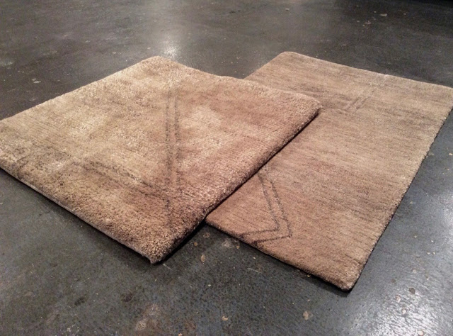
Texture reigned supreme, none more interesting and compelling from a sales perspective than Lapchi’s new – for lack of a coined word – ‘Plush’ texture. Made in Nepal of Himalayan wool the construction mixes sumptuously long and short pile heights providing for both a lovely feel underfoot and the hand and sheen of a fine badger hair shaving brush. Or was it more like mohair? Regardless of the adjective of your choosing, the Plush texture innovates Lapchi’s product line by providing their clients with even more options. ‘Lapchi is doubling down on custom.’ Kerry Smith told me, as he and the staff graciously showed me the entire collection.
Beyond the new designs shown in ‘Plush’ that add to Lapchi’s already extensive repertoire, the obvious question had to be: ‘Can I make the existing designs in the new texture?’ The answer, as one would expect from a carpet house that all but brought custom to the broader market, is ‘Yes’, with the usual caveats one associates with quality and texture changes.
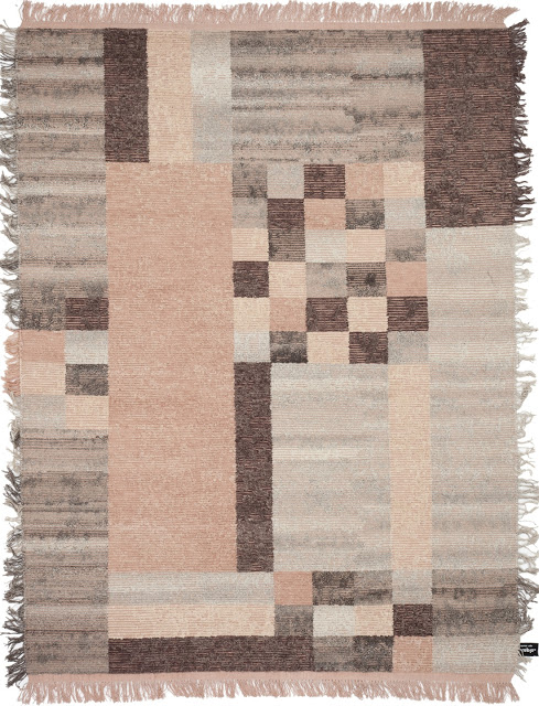
Had I not already been enjoying the craftsmanship, attention to detail, and of course texture of ‘Oldie Element Cubo’ from cc-tapis, I would have been moved to by the words of Fabrizio Cantoni as he showed me the line, ‘We like to do things the ‘proper’ way.’ For cc-tapis this does not mean choosing one particular method of construction to use carte blanche across the breadth of their product line, rather it means a holistic examination of the design, the intentions, and what exactly the finished carpet is supposed to look like. For ‘Oldie Element Cubo’, as the name suggests, the intent was to create a rug that seems old or rather ‘lived-in’, with a warmth of character about it. ‘We have tried to make them soft and comfortable whilst still maintaining a certain level of tactility, to create a texture that makes them wonderful to touch and live with and at the same time creating the aesthetic language of the rug.” Steve Wilson of cc-tapis tells me via email, ‘To create this effect without any acid or chemical washes, we decided to use cross-weave, as it is a more ‘antique’ style of creating rugs. The technique lends itself to the concept and overall aesthetic of the rug.’ he concludes. The near blanket like handle of the carpet, the surprise of fringe on all four (4) sides, and the extremely flattering in all lights colourway of ‘Cipria’, all soften the geometry (which I love) of the piece.
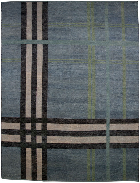
Speaking of geometry… I present this stunning plaid from French Accents. During NYICS they showed the warmer maize colouration from this collection but when I saw this stunning version, I just could not resist showing it instead. With accent stripes in pale turquoise, a lovely herbal green, charcoal and white, all set upon upon a mysterious blue, I cannot help but think of the shore where ocean meets land. The ‘Highlands’ are more than a place, they are a feeling and this carpet perfectly captures that feeling. Furthermore, it’s a shame photographs do not do the texture of this carpet justice, so I encourage you, if opportunity presents, to see this rug in person.
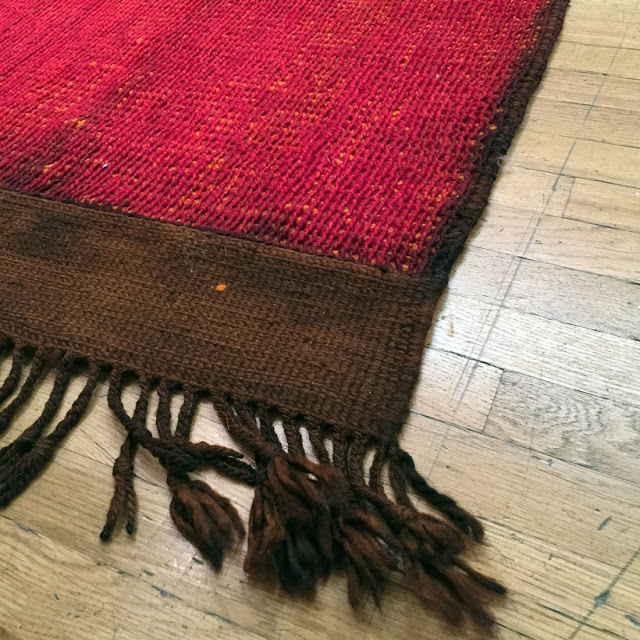
One does want a hint of colour and this ‘Toureg Mat’ from Jan Kath delivers all that and more with a bright and highly sophisticated punch of red that leaves you longing for more. Utilizing the ability of our mind’s eye to blend colour, the underlying squash-like orange is merged with the intense blood red on top to create a perceived colour of far greater depth and nuance than one can achieve through any one single colour yarn. Paired with the warm coffee ground brown overcasting, extra wide woven ends, and braided fringe, this carpet, if it were the welcoming ‘Red Carpet’, would tell those who trod upon it ‘we know what we’re doing when it comes to making carpets.’
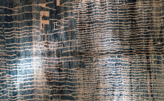
Soufiane Zarib presented an impressive collection of Moroccan rugs with this standout piece – shown in what I am calling Marine Blue – representing the single best colour presented during the whole of the NYICS. Typically one would select a carefully styled and perfectly lit professional photograph when presenting a rug, but in this case an even representation of colour would not do justice to this carpet. The richness and appeal are derived from its ability – as with most carpets – to react and appear different under various lighting scenarios. Instead of a single flat blue we are presented with a myriad of values – achieved both through lighting and abrash – that all have the characteristic metallic sheen of coloured anodized aluminum and the visual interest to make any interior sparkle.
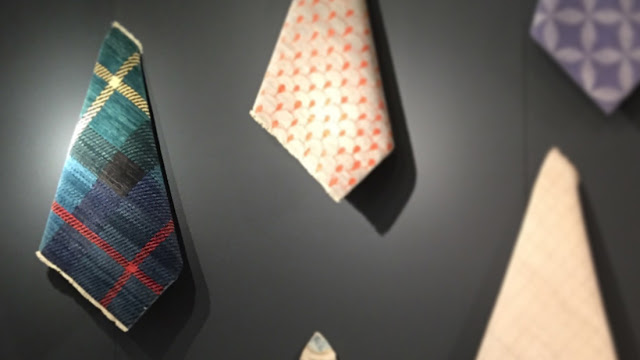
Warp & Weft made their inaugural appearance as an exhibitor with a striking visual display of samples from their new limited wholesale program. As one of only two (2) exhibitors who wisely chose to differentiate their booths through the use of painted walls, they reminded us that presentation and branding are important components (along with amazing carpets) to a successful company in this, our ever competitive marketplace. Since geometrics and plaid-like carpets seem to be a secondary theme, I’d like to highlight this flawlessly coloured and executed example from Warp & Weft shown in a palette comprised of gunmetal blue, aquamarine, emerald, charcoal, cerise, and honey wheat. When asked the name of the design, Michael Mandapati responded ‘Tartan’ which sparked the following paraphrased dialog:
The Ruggist: But that’s not really a Tartan is it?
Mr. Mandapati: What do you mean?
The Ruggist: Well, it looks like a plaid, not a tartan. All tartans are plaids, but not all plaids are tartans. Just like all congnac is brandy, but not all brandy is cognac.
Mr. Mandapati: *Laughing* What’s the difference?
The Ruggist: [Insert long winded technical description involving unironically warp and weft that concludes] but that is a technical definition.
Mr. Mandapati: But is it that important? It’s just a name.
The Ruggist: To other pedants like myself, extremely!! But I do see your point.
Regardless of whether it is a plaid or a tartan (technically it’s a plaid), it’s a great rug that well fits the style and aesthetic we’ve come to expect from Warp & Weft. Oh! As a footnote: Warp & Weft recently completed the move to and expansion of their showroom at the Decoration and Design Building in New York City; a move brought about by the redevelopment of their former home on Madison Avenue. I took some time after the NYICS Panel Discussion to visit the showroom while it was still in the finishing stages of construction and it was shaping up to be the perfect architectural backdrop to their carpets! Kudos!
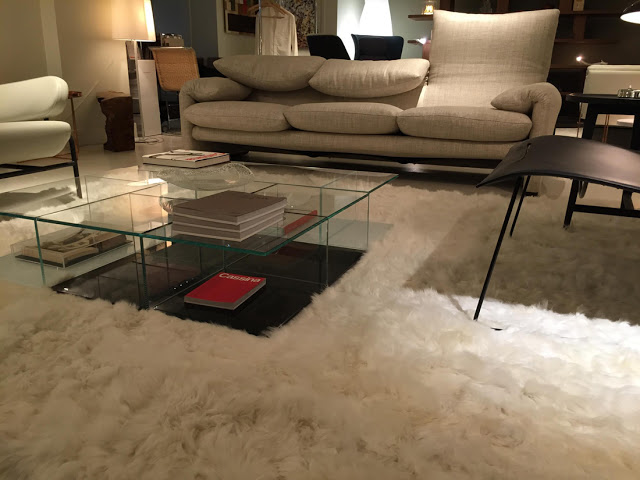
One final noteworthy texture – both visual and tactile – is really the entire line of animal hide rugs from Yerra. If forced to choose one however, the winner as it were would be the cloud like and ethereal Alpaca. To look at the rug (as shown above) is to imagine a room set upon a cloud or amidst a fog bank, to touch it is another sensation all together. The softness and long flowing nature is unmatched and it begs the question: ‘Why does mankind bother with synthetic materials when nature provides things such as this?’
Overall the 2015 NYICS was a visual feast for the eyes and a tactile treat for the hands and underfoot. The changes made by new shown owner and consummate impresario Murtaza Ahmadi lay the necessary foundations for future success. Efforts to include educational seminars and panel discussions are well warranted as the industry must realize and embrace the fact that the lines between trade/retail/wholesale/consumer continue to blur. The inclusion of a late afternoon open bar and an early morning coffee and sweets table were a welcome feature of the show that afforded everyone the benefit of relaxed mingling and socializing.
I was most impressed by the caliber of the guests chosen for the panel discussion on the final day of the show, but wished that information had been distributed earlier as an opportunity to listen to Joe Carini and James Ffrench discuss rugs and carpets does not come everyday. The inclusion of Karen Marx of Elle Decor on the panel added a much needed outside perspective, though I feel a moderator more well versed in rugs and carpets might have been a better choice. It’s somewhat disappointing that more people did not attend the seminars by Roz Rustigian as there is always something that can be learned. Perhaps that is solely a function of low show attendance, or perhaps it’s because all of us already think we know everything, but I digress. In what turned out to be an annoyingly pervasive conversation topic during the NYICS, we conclude with a mention of the show dates and low attendance. It is widely agreed that the low attendance was a direct result of the show dates not corresponding to those of other late summer New York City shows, a problem Mr. Ahmadi assures will be remedied for 2016.


